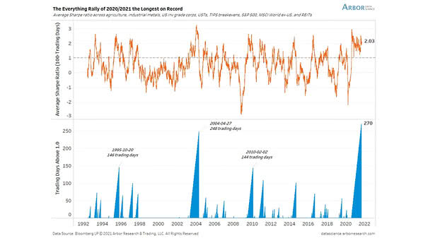
Markets – Average Sharpe Ratio Across Assets
Markets – Average Sharpe Ratio Across Assets How long will the “everything rally” last? Image: Arbor Research & Trading LLC
Markets – Average Sharpe Ratio Across Assets How long will the “everything rally” last? Image: Arbor Research & Trading LLC
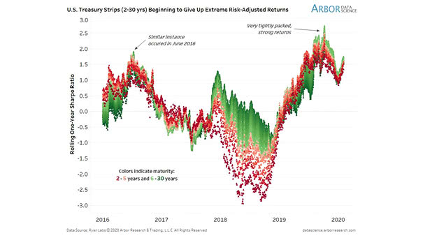
Sharpe Ratio and U.S. Treasury Strips Curve Historically, high sharpe ratios have been usually unsustainable. Image: Arbor Research & Trading LLC

Risk & Return, and Sharpe Ratio This chart shows risk and return since 1970 and since the 2009 low, including the Sharpe ratio. Image: Fidelity Investments
Asset Class and Sharpe Ratio Since 1990 The sharpe ratio is a measure of risk-adjusted return. This year, major asset classes have a positive and high sharpe ratio. Image: Arbor Research & Trading LLC Click the Image to Enlarge
Sharpe Ratio for the S&P 500 U.S. stocks have had the best decade since the 1950s. The sharpe ratio is a measure of risk-adjusted return. Image: Bloomberg
U.S. 10-Year Treasury Note Produces Highest Sharpe Ratio in Decades Since 1990, the U.S. 10-Year Treasury Note has produced the largest sharpe ratio. Is it the beginning of the end like past events? Image: Arbor Research & Trading LLC
U.S. 10-Year Treasury Note Produces Extremely High Sharpe Ratio During Shifts to Easing This chart shows the high sharpe ratio of U.S. 10-Year Treasury Note during easing policy shifts. Image: Arbor Research & Trading LLC
S&P 500 Quarterly Earnings Deutsche Bank anticipates a modest slowdown in S&P 500 earnings growth due to tariffs, whereas the consensus expects a significantly sharper deceleration in Q2 2025. Image: Deutsche Bank Asset Allocation