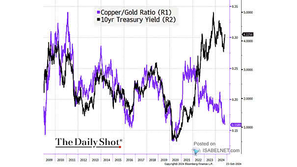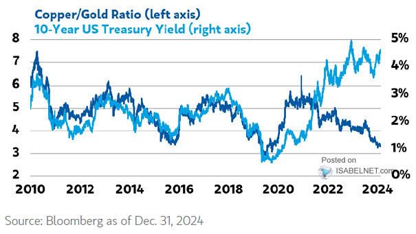
Copper to Gold Ratio and U.S. 10-Year Treasury Yield (Leading Indicator)
Copper to Gold Ratio and U.S. 10-Year Treasury Yield (Leading Indicator) The copper/gold ratio and the 10-year U.S. Treasury yield are showing signs of a persistent divergence. Image: Morgan Stanley Research