Global Monetary Policy Map
Global Monetary Policy Map This chart shows that in 2019, central banks cut rates by most in a decade. Image: Topdown Charts
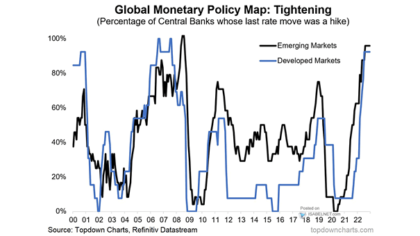
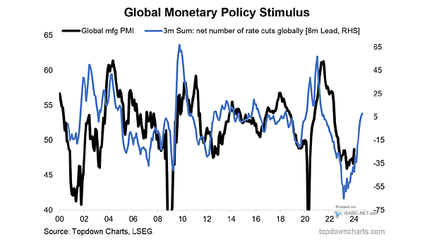
Central Banks – Global Monetary Policy Stimulus Leads Global Manufacturing PMI Great chart suggesting that global monetary policy stimulus leads global manufacturing PMI by 8 months. The global manufacturing PMI could rebound in 2020. Image: Topdown Charts
Central Banks – Market Risk Trend and Economic Policy Trend Chart suggesting that risk assets’ sensitivity to political risks has been neutralized by central banks’ QE and dovish monetary policy stance. Image: Image: BofA Global Research
VIX and Fed Monetary Policy This year, the VIX average has been similar to 2018, despite Feds’ policy U-Turn in January. Image: BofA Merrill Lynch Global Research
Global Financial Conditions Index and Global Manufacturing PMI Chart suggesting that easier financial conditions should feed through to growth, unless monetary policy is less effective. Image: Goldman Sachs Global Investment Research
A Hall of Mirrors in Monetary Policy? This chart suggests a feedback loop between bond market pricing and central bank decisions. Image: Goldman Sachs Global Investment Research
Wave of Zombie Companies in Europe Zombie companies in Europe are back on the rise, thanks to an unprecedentedly easy monetary policy. Image: BofA Global Research
Zombie Companies in Europe After years of unprecedentedly easy monetary policy, zombie companies in Europe are back on the rise. Image: BofA Merrill Lynch Global Research