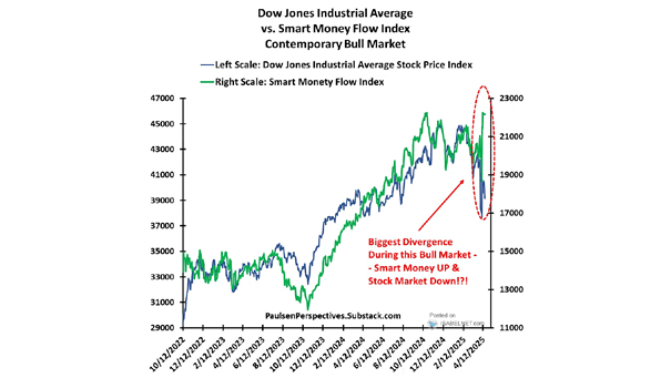
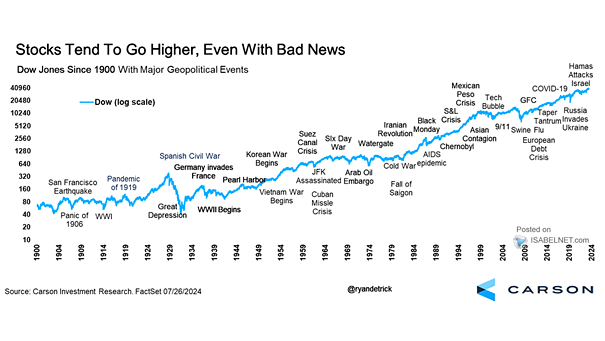
CTAs’ Net Position in Dow Jones Futures vs. the Dow Jones
CTAs’ Net Position in Dow Jones Futures vs. the Dow Jones CTAs continue to increase their long positions in Dow Jones futures. Image: Nomura
Valuation – Dow Jones Industrial Average from 1921 to 1954 It took the Dow Jones 25 years to regain its 1929 highs. Is the U.S. stock market currently in bubble territory? Image: Financial Times
Performance – Dow Jones High Yield Select 10 Index Relative to S&P 500 The Dogs of the Dow (10 highest yielding stocks in the Dow Jones) tend to outperform the S&P 500 after recessions. Image: Financial Times
Dow Jones Industrial Average vs. S&P 500 The Dow Jone Industrial Average is lagging the S&P 500, as it is underweight in technology and overweight in financials and industrials. Image: CNBC
Secular Bull Market – Dow Jones Industrial Average and 30-Year Bond Cycles Chart suggesting a “new” secular bull market underway with the potential to last until 2034. Image: Fundstrat Global Advisors, LLC
Dow Jones Industrial Average – Present vs. 1930 This chart compares the Dow Jones Industrial Average to 1930 (for informational purposes only). Image: Nautilus Research
U.S. Elections – Dow Jones vs. Presidential Political Party Republicans vs. Democrats: this chart shows that Dow Jones returns have been much better when a Democrat held the presidency. Image: Ned Davis Research
Performance for the Year: S&P 500, Nasdaq Composite and Dow Jones Industrial Average U.S. stocks climbed, erasing 2020 losses, as easing lockdowns boosts risk appetite. Image: Financial Times
Valuation – Commodities Relative to the Dow Jones Commodities relative to the Dow Jones are trading at the lowest valuation level since the mid-1960s. Image: Incrementum
Dow Jones to Gold Ratio Since 1800 This long-term chart suggests the potential fall in share prices expressed in gold. Image: Incrementum AG