Volatility – VIX and U.S. 1-Year Sovereign CDS
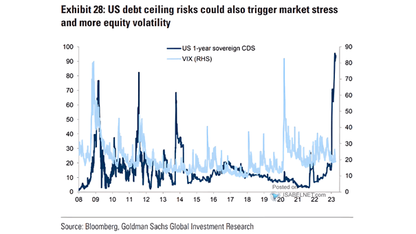
Volatility – VIX and U.S. 1-Year Sovereign CDS The U.S. debt ceiling circus could lead to volatility in financial markets. Image: Goldman Sachs Global Investment Research
Volatility – VIX and U.S. 1-Year Sovereign CDS The U.S. debt ceiling circus could lead to volatility in financial markets. Image: Goldman Sachs Global Investment Research
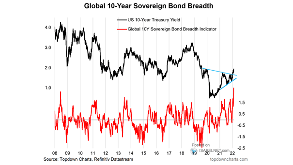
Global 10-Year Sovereign Bond Breadth Will global 10-year sovereign bond yields continue to rise? Image: Topdown Charts

U.S. Outstanding Marketable Sovereign Debt Burden Investors still perceive U.S. debt to be safe for now, despite it is getting bigger and bigger. Image: Morgan Stanley Wealth Management
World Sovereign Debt and Global Central Banks’ Holdings of Domestic Sovereign Debt Central Banks now own a high percentage of all global sovereign debt, leading to higher debt levels in coming years. Image: BofA Merrill Lynch Global Research
Sovereign Ratings Map Interesting map of sovereign ratings across the world in July 2019, using Moody’s ratings. Source: Moody’s Sovereign Ratings, Aswath Damodaran
Sovereign Bonds with Negative Yields This chart puts things into perspective by showing the share of developed market sovereign bonds with negative yields (1-10 year maturities). Image: Credit Suisse
Demographics Explain Sovereign 30-Year Yields Accross Emerging Markets Another great chart showing that emerging market demographics explain 30-year sovereign bond yields. An R² of 0.80 is quite high and significant. You may also like “U.S. Population Growth vs. U.S. 10-Year Treasury Bond Yield.” Image: Arbor Research & Trading LLC
Coronavirus – EM High Yield Spread The coronavirus pandemic has left credit spreads at distressed levels for a number of EM high-yield sovereigns. Image: Goldman Sachs Global Investment Research
Central Bank Ownership of Domestic Government Debt This chart shows the rise of central banks as holders of sovereign debt, pushing sovereign yields to historically low levels. Image: Deutsche Bank Global Research
Greek’s 5-Year Bond Yields Have Fallen Below US 5-Year Government Bond Yield Which one would you choose? Greek bonds or US counterparts? This is a great example of financial market madness. Mark Twain once said, “History doesn’t repeat itself, but it does rhyme.” That’s true! Greece has spent around half its time in default on its…