Confidence – S&P 500 and NFIB Headline
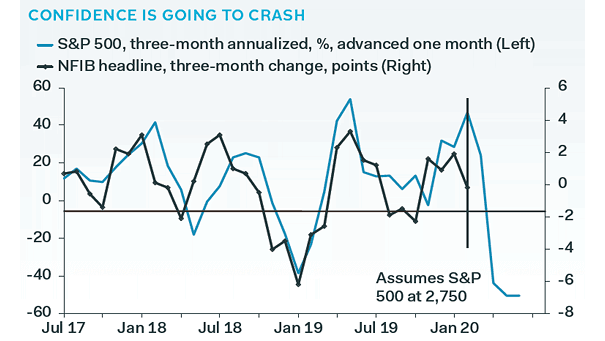
Confidence – S&P 500 and NFIB Headline This chart suggests that confidence is going to crash. Image: Pantheon Macroeconomics
Confidence – S&P 500 and NFIB Headline This chart suggests that confidence is going to crash. Image: Pantheon Macroeconomics
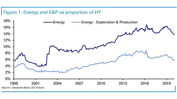
Energy and Exploration & Production as Proportion of High Yield Is a market carnage coming? Energy accounts for a significant portion of the U.S. high-yield market, with a share of about 14%. Image: Deutsche Bank
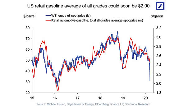
WTI Crude Oil Spot Price and Retail Automotive Gasoline U.S. retail gasoline prices are expected to fall, as OPEC+ failed to agree production cuts. Image: Deutsche Bank Global Research
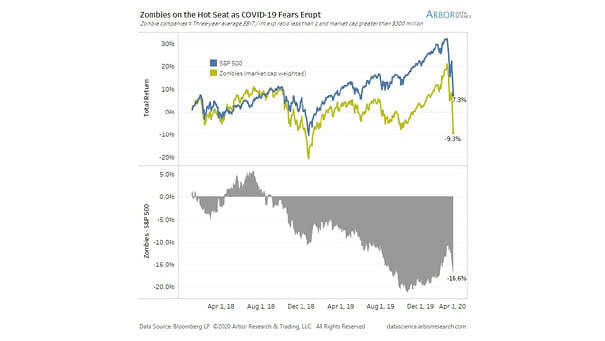
S&P 500 vs. U.S. Zombie Companies U.S. zombie companies have significantly underperformed the S&P 500. Image: Arbor Research & Trading LLC
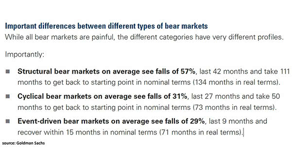
Important Differences Between Different Type of Bear Markets Goldman Sachs suggests that the current bear market looks like an event-driven bear market. Image: Goldman Sachs Global Investment Research
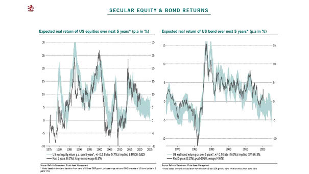
Expected Real Return of U.S. Equities and U.S. Bond Over Next 5 Years This chart suggests a real return of around 5% p.a. on U.S. equities over the next 5 years vs. -5% for U.S.…
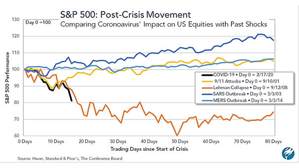
S&P 500 Post-Crisis Movement This chart compares the coronavirus impact on U.S. equities with past shocks. The impact looks more like the Lehman Brothers collapse. Image: The Conference Board
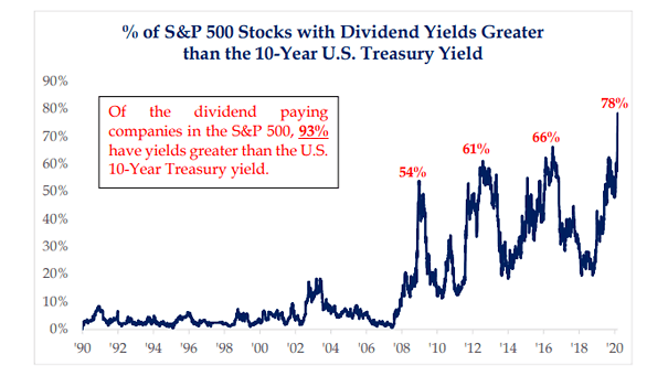
% of S&P 500 Stocks with Dividend Yields Greater than the 10-Year U.S. Treasury Yield 78% of S&P 500 stocks have a dividend yield greater than the 10-year U.S. Treasury yield. Image: Strategas Research Partners
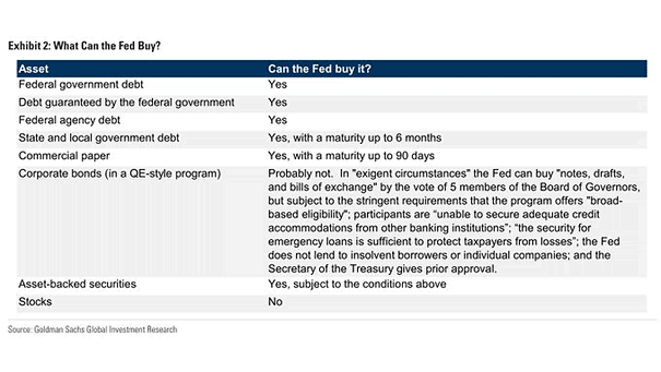
What Can the Fed Buy? The table shows the assets that the Fed can buy. Image: Goldman Sachs Global Investment Research
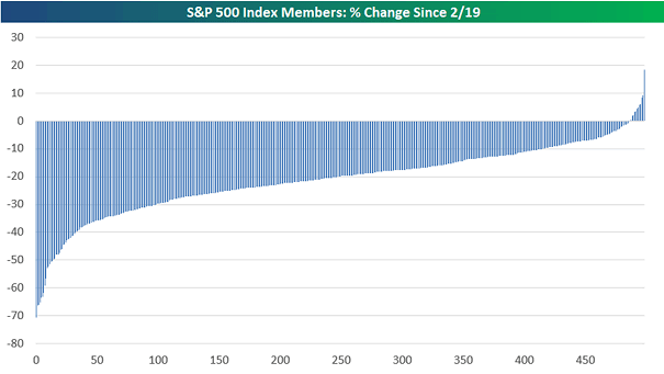
S&P 500 Index Members and Bear Market Half of the S&P 500’s index members are in a bear market in the last 13 trading days. Image: Bespoke Investment Group
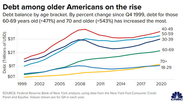
U.S. Debt Balance by Age Bracket Debt among oldest Americans increased 543% from 1999 through 2019. Image: CNBC