Inequality – Breakdown of U.S. Households’ Equity Ownership
Inequality – Breakdown of U.S. Households’ Equity Ownership The top 1% own more than 50% of stocks held by US households. Image: Financial Times
Inequality – Concentration of Equities Ownership by Wealth Class in the U.S. The top 1% of households owns equities, while the bottom 50% of households owns real estate. Image: Goldman Sachs Global Investment Research
Inequality – Net Saving by Wealth Class in the U.S. This chart shows that the savings rate for the bottom 90% of the U.S. population is negative since the 1990s. Image: Deutsche Bank Global Research
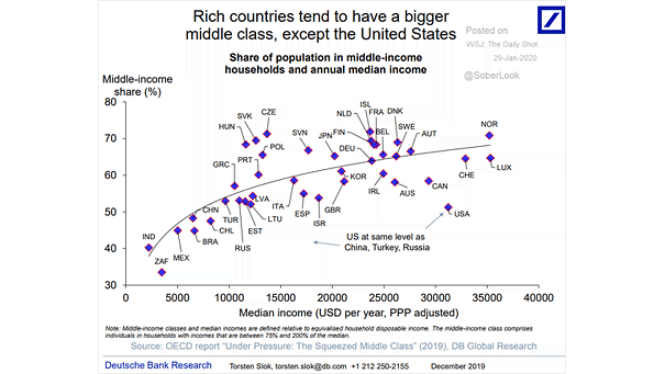
Inequality – Share of Population in Middle-Income Households and Annual Median Income The middle class is shrinking rapidly in the United States. It’s at the same level as China, Turkey and Russia. Image: Deutsche Bank Global Research
Inequality – Median Wealth of U.S. Families The median value of assets owned by an American family is no higher than it was 20 years ago. Image: PEW Research Center
Inequality – Percent of Total Investment Assets Held by Wealth Distribution The U.S. economy is not the stock market. The top 10% of American households own 84% of all stocks, and the bottom 90% own 16% of all stocks. Image: Deutsche Bank Global Research
Inequality – Monthly Income After Tax Minus Average Monthly Expenditures Greatest economy ever? Despite increasing wage growth and a low unemployment rate, half of the U.S. population spends more than their income. Image: Deutsche Bank Global Research
Inequality – Share of National Net Worth Net worth inequality in the United States worsens. Images: Reuters
Inequality – Intergenerational Earnings Elasticity and Gini Coefficient Chart suggesting that social mobility cannot be achieved without greater equality (R² = 0.5) Image: Financial Times
Breaking Down Income Inequality in the U.S. Income inequality in the U.S. worsens. This chart puts things into perspective. Image: howmuch.net