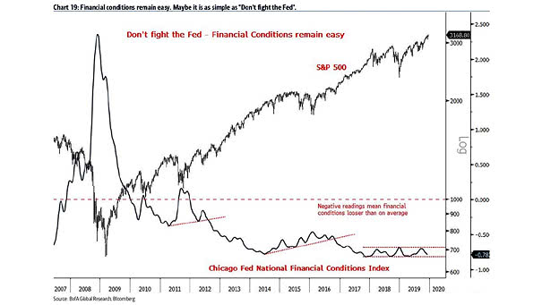
Chicago Fed National Financial Conditions Index and S&P 500
Chicago Fed National Financial Conditions Index and S&P 500 Financial conditions remain easy, which is historically bullish for U.S. equities. Image: BofA Global Research
Chicago Fed National Financial Conditions Index and S&P 500 Financial conditions remain easy, which is historically bullish for U.S. equities. Image: BofA Global Research
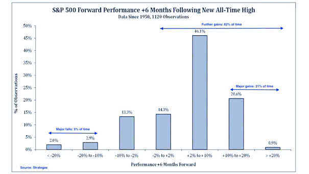
S&P 500 Forward Performance +6 Months Following New All-Time High Since 1950 Historically, there are major falls 5% of time, further gains 82% of time and major gains 21% of time. Image: Strategas

OECD Composite Leading Indicators Currently, 15.8% of OECD Composite Leading Indicators are above 100. Historically, equities have performed rather well at this level. Image: Arbor Research & Trading LLC
Multiple Expansion – Year-Over-Year Change in the S&P 500 Forward P/E Since the beginning of the year, the multiple expansion explains the S&P 500 return. Historically, S&P multiples contract or remain flat following years of big multiple expansion. Image: BofA Merrill Lynch US Equity & US Quant Strategy
S&P 500: How Often Months Are the Best or Worst of the Year? Historically, August has been the worst most often, and April the best the most. Image: Ryan Detrick, LPL Financial LLC
December Return vs. All Months Return Historically, the percentage of positive returns in December has been above average for stocks and bonds since 1990. Image: Goldman Sachs Global Investment Research
S&P 500 Returns After 20%-plus Gains at the End of October Historically, the return for the last two months has averaged 6.2%. Image: LPL Research
Global Debt Levels – Advanced Economies and Emerging Markets Historically, high debts create serious risks. Global debt levels have increased significantly since the Global Financial Crisis. Image: BofA Merrill Lynch Global Research
Range of Returns Two Years After Fed Rate Cut Historically, equities rally significally, when the Fed eases during soft patches. Image: Barclays Research
ISM Manufacturing PMI and Nonfarm Payroll Growth vs. U.S. Election Outcome Chart showing the relationship between growth trends into U.S. elections and the margin of victory or defeat for incumbent candidates. Historically, the probability of incumbents winning an election increases, as growth trends improve. Image: Bessemer Trust
Oil, Gold, Silver, and Wheat vs. Commodities Chart showing that individual commodities have historically moved together over a long period of time. Image: Wells Fargo Investment Institute