U.S. Industrial Production and GDP
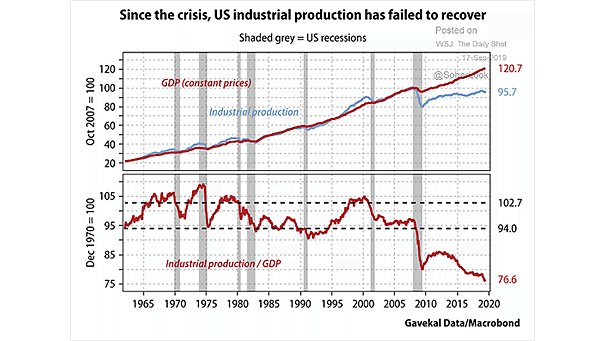
U.S. Industrial Production and GDP This chart clearly shows the divergence between U.S. industrial production and GDP, since the financial crisis. Image: Gavekal, Macrobond
U.S. Industrial Production and GDP This chart clearly shows the divergence between U.S. industrial production and GDP, since the financial crisis. Image: Gavekal, Macrobond
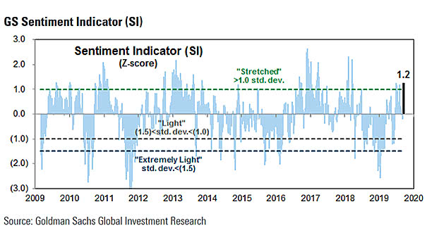
Sentiment Indicator Are investors be too bullish? Currently, the sentiment indicator is above average at 1.2 standard deviations. Image: Goldman Sachs Global Investment Research
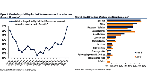
U.S. Recession Probability – BofA Survey The September edition of the BofA survey shows that U.S. credit investors see a 25% chance of recession over the next 12 months. Image: BofA Credit Investor Survey
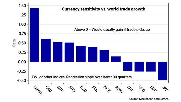
Currency Sensitivity vs. World Trade Growth CAD and GBP are the most sensitive currencies in G10 space to world trade growth. Image: Nordea and Macrobond
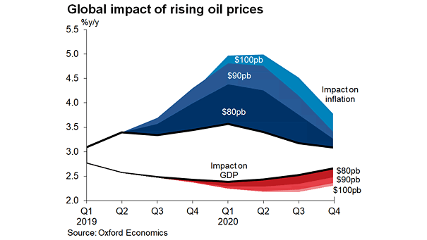
Global Impact of Rising Oil Prices on Global GDP and Inflation Nice chart showing the global impact of rising oil prices on GDP and inflation. Image: Oxford Economics
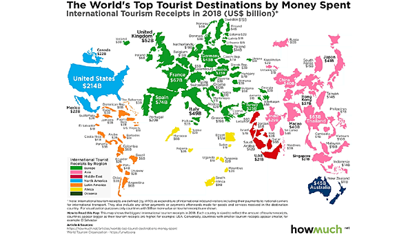
Economy – The World’s Top Tourist Destination by Money Spent The United States is the top tourist destination by money spent. Image: howmuch.net
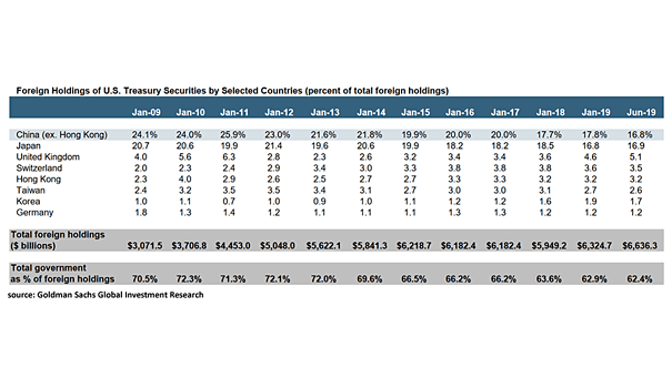
Foreign Holdings of U.S. Treasury Securities by Selected Countries Japan and China are the two major foreign holders of U.S. Treasury securities. Currently, Japan surpasses China as largest foreign holder of U.S. Treasuries. Image: Goldman Sachs Global Investment Research
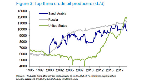
Top Three Crude Oil Producers Chart showing that the U.S. is the world’s biggest oil producer and has surpassed Russia and Saudi Arabia. Image: Deutsche Bank Global Research
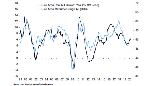
Euro Area Real M1 Growth Leads Euro Area Manufacturing PMI This chart suggests that euro area real M1 growth leads euro area manufacturing PMI by 9 months. Image: Morgan Stanley Research
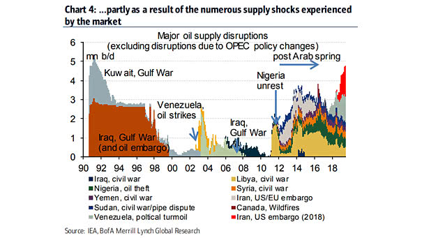
Major Oil Supply Disruptions As a reminder, disruptions in the oil market have always led to higher oil prices. Image: BofA Merrill Lynch Global Research
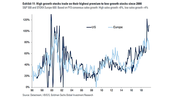
High Growth Stocks vs. Low Growth Stocks Chart suggesting that high growth stocks are expensive relative to low growth stocks. Image: Goldman Sachs Global Investment Research