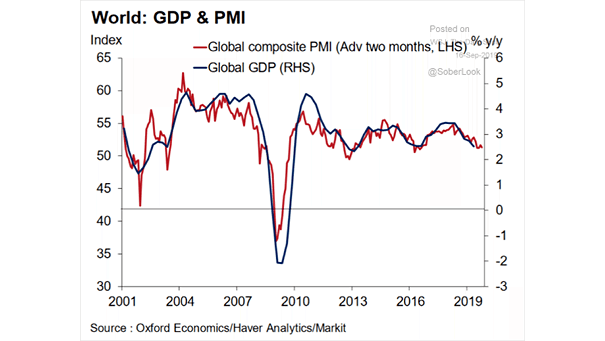
Global Composite PMI Leads Global GDP
Global Composite PMI Leads Global GDP Growth Chart suggesting that the global composite PMI leads global GDP growth by 2 months. Image: Oxford Economics
Global Composite PMI Leads Global GDP Growth Chart suggesting that the global composite PMI leads global GDP growth by 2 months. Image: Oxford Economics
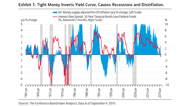
M1 Money Supply vs. Yield Curve and Recessions Great chart showing the correlation between M1 money supply and the yield curve. The key factor for inverted yield curves is tight money. Image: BofA Merrill Lynch Global Research
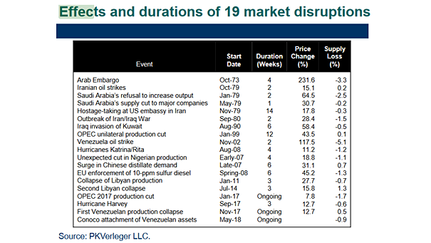
Effects and Durations of 19 Oil Market Disruptions This table shows that disruptions in the oil market have always led to higher oil prices. Image: PKVerleger, LLC
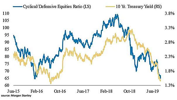
Cyclical/Defensive Equities Ratio and 10-Year Treasury Yield The chart shows the correlation between the cyclical/defensive equities ratio and the 10-year treasury yield, signaling an economic slowdown. Image: Morgan Stanley Research
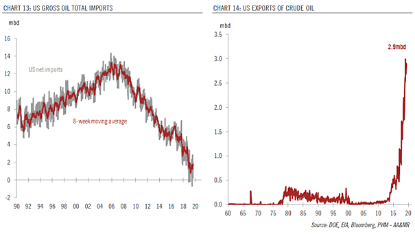
U.S. Gross Oil Total Imports and Exports of Crude Oil The United States has surpassed Russia and Saudi Arabia, and is the world’s biggest oil producer. Image: Pictet Wealth Management
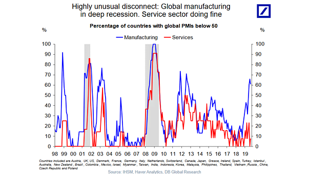
Global Manufacturing vs. Service Sector This chart shows that the global manufacturing sector is in recession, while the service sector is doing well. Image: Deutsche Bank Global Research
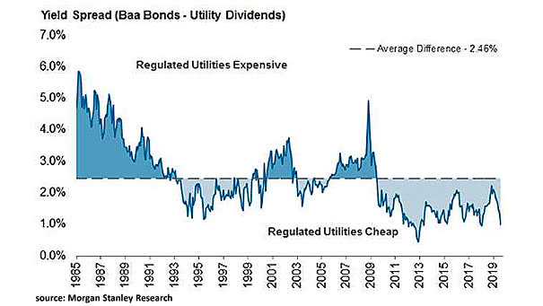
Yield Spread (Baa Bonds – Utility Dividends) This interesting chart suggests that utilities are currently cheap. Image: Morgan Stanley Research
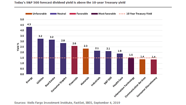
S&P 500 Forecast Dividend Yield Is Above The 10-Year Treasury Yield Dividends remained stable or increased, while the 10-year Treasury yield has declined. Image: Wells Fargo Investment Institute
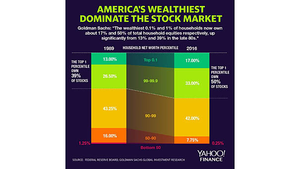
Inequality – Concentration of Stock Ownership by Wealth Class in the U.S. The top 1% own 50% of stocks held by American households. Image: Yahoo! Finance
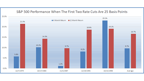
S&P 500 Performance When the First Two Rate Cuts Are 25 Basis Points Over 40 years, the S&P 500 returns over 6 and 12 months were all positive when the first two rate cuts were 25 bps. Image: Ryan Detrick, LPL Financial LLC
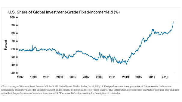
U.S. Share of Global Investment-Grade Fixed-Income Yield With negative yields in Europe and Japan, the U.S. now accounts for 95% of the positive investment-grade yield. Image: Legg Mason