Demographics – Older Societies Have Lower Inflation
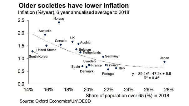
Demographics – Older Societies Have Lower Inflation This interesting chart shows again that an aging population leads to lower inflation (R² = 0.45). Image: Oxford Economics
Demographics – Older Societies Have Lower Inflation This interesting chart shows again that an aging population leads to lower inflation (R² = 0.45). Image: Oxford Economics
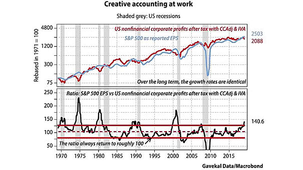
S&P 500 EPS vs. U.S. Nonfinancial Corporate Profits Creative accounting is imaginative ways to present accounts. The divergences between earnings and U.S. nonfinancial corporate profits occur before recessions. Image: Gavekal, Macrobond
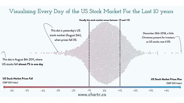
Every Day of the U.S. Stock Market for the Last 10 Years Interesting chart showing that moves over 1% have been quite rare over the last 10 years. Picture souce: Chartr Ltd
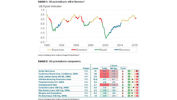
U.S. Business Cycle Indicator The Morgan Stanley’s cyclical indicator is still in “downturn.” The entry into the “downturn” phase suggests lower returns for stocks and risky assets. Image: Morgan Stanley Research
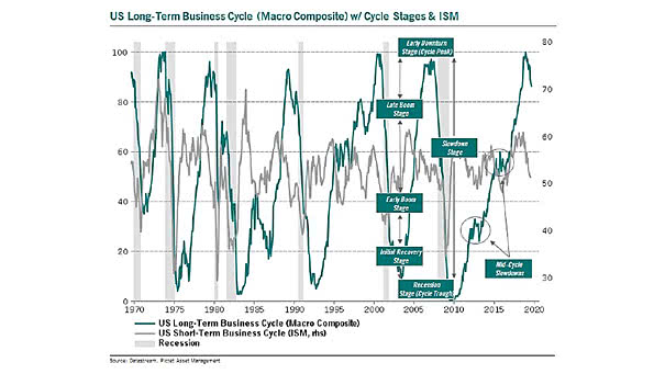
ISM Manufacturing Index and U.S. Long-Term Business Cycle The risk of recession increases when the Macro Composite is above 90% and the ISM Manufacturing Index is falling. Image: Pictet Asset Management
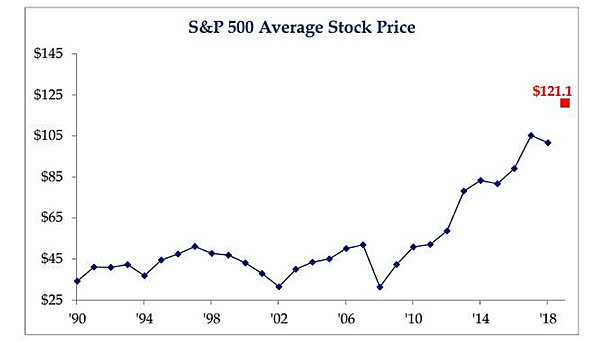
S&P 500 Average Stock Price The S&P 500 average stock price reaches a new high, due to the absence of stock splits. Image: Strategas
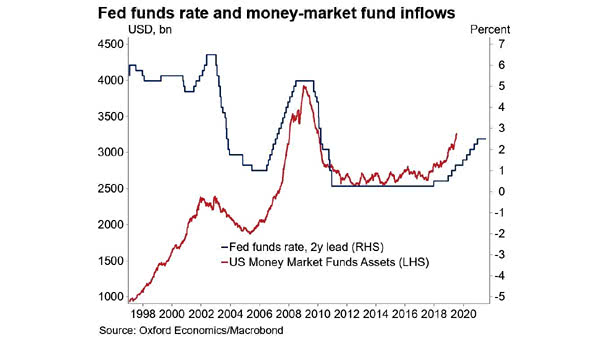
Fed Funds Rate Leads Money-Market Fund Inflows The chart suggests that Fed funds rate leads money-market fund inflows by two years. Money-market fund inflows stop when risk becomes attractive again. Image: Oxford Economics, Macrobond
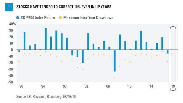
S&P 500 Maximum Intra-Year Drawdown Since 1950, the average maximum drawdown for the S&P 500 is -13.5% and the median is -10.6%. You may also like “S&P 500 Index Drawdowns From 2 Year Highs.” Image: LPL Research
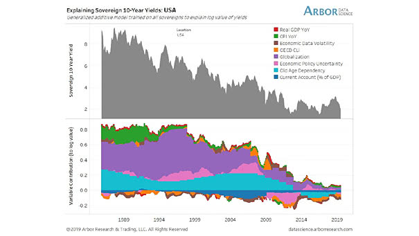
USA – Explaining 10-Year Yields This great chart suggests that demographics and globalization explain U.S. 10-year yields. Image: Arbor Research & Trading LLC
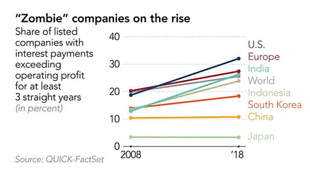
Zombie Companies on the Rise Investor demand for leveraged loans and artificially low interest rates have created zombie firms. Image: Quick Factset
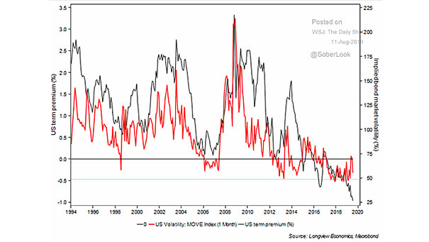
MOVE vs. Treasury Term Premium This chart shows the nice correlation between MOVE (implied volatility of U.S. Treasury markets) and the Treasury term premium. The term premium is the risk premium (or the bonus) that investors receive for the risk of owning longer-term bonds. Image: Longview Economics, Macrobond