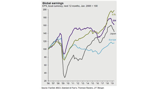
Demographics Explain Sovereign 30-Year Yields Across Emerging Markets

Demographics Explain Sovereign 30-Year Yields Accross Emerging Markets Another great chart showing that emerging market demographics explain 30-year sovereign bond yields. An R² of 0.80 is quite high and significant. You may also like “U.S. Population Growth vs. U.S. 10-Year Treasury Bond Yield.” Image: Arbor Research & Trading LLC

“Yield Curve” Google Trends vs. 10Y-3M Yield Spread

“Yield Curve” Google Trends vs. 10Y-3M Yield Spread This interesting chart shows the Google trends interest for the “yield curve” compared to the U.S. 10-year minus 3-month Treasury yield spread. If history helps us predict the future, the next market peak could be in 2021 or later, maybe. Image: Ken Fisher

Concern about the Trade War

Concern about the Trade War 58% of American firms reported negative impacts from the trade war, versus 31% of non-American firms. Ouch! Image: American Chamber of Commerce in Singapore

S&P 500 and Recession Probability

S&P 500 and Recession Probability Great chart showing twelve Fed easing cycles since the 1950s, including the recession probability and the average return of the S&P 500 Index. Image: Fidelity Investments

Growth Has Outperformed Value Since 2015

Growth Has Outperformed Value Since 2015 Is is time for value stocks to shine? Actually, tech stocks contribute to widening the gap between growth and value. Image: Wells Fargo Investment Institute

U.S. 10-Year Yields vs. Copper to Gold Ratio

U.S. 10-Year Yields vs. Copper To Gold Ratio Great chart showing a strong correlation between U.S. 10-year yields and the copper to gold ratio. Image: Nordea and Macrobond

U.S. Federal Debt Held by the Public

U.S. Federal Debt Held by the Public Rising U.S. federal debt could increase the likelihood of a fiscal crisis in the future. Image: Congressional Budget Office