ISM Manufacturing PMI and Recession Probability
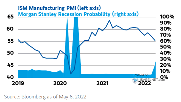
ISM Manufacturing PMI and Recession Probability Morgan Stanley’s recession indicator signals a 27% probability of a downturn in the next 12 months. Image: Morgan Stanley Wealth Management
ISM Manufacturing PMI and Recession Probability Morgan Stanley’s recession indicator signals a 27% probability of a downturn in the next 12 months. Image: Morgan Stanley Wealth Management
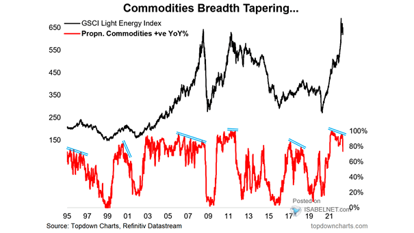
Commodities Breadth Tapering After a historic two years, should investors be bearish on commodities right now? Image: Topdown Charts
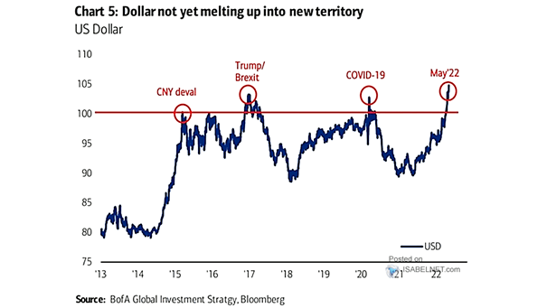
U.S. Dollar May the U.S. dollar be reaching a peak? Image: BofA Global Investment Strategy
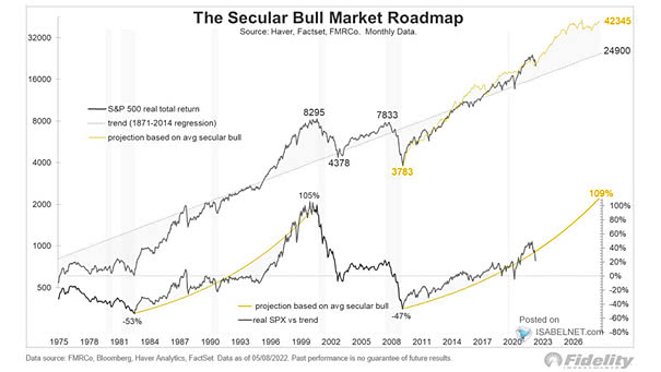
S&P 500 – The Secular Bull Market Roadmap So far, U.S. stocks continue to behave like a secular bull market. Image: Fidelity Investments
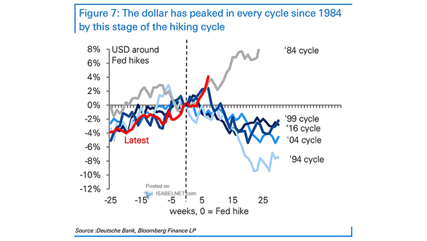
U.S. Dollar Around Fed Hikes Will the U.S. dollar peak at this stage of the Fed’s hiking cycle. Image: Deutsche Bank
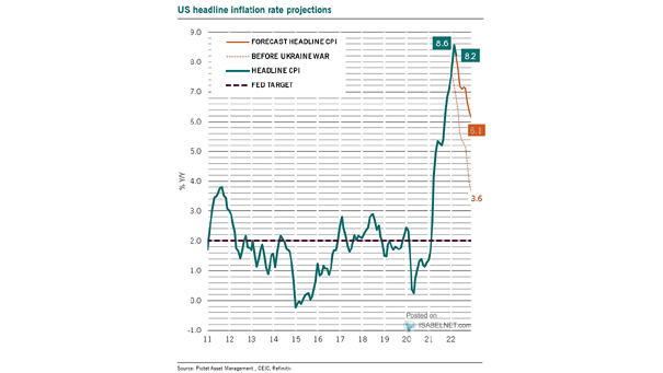
U.S. Headline Inflation Rate Projections With slightly better inflation news, U.S. headline inflation is expected to decline throughout the rest of the year. Image: Pictet Asset Management
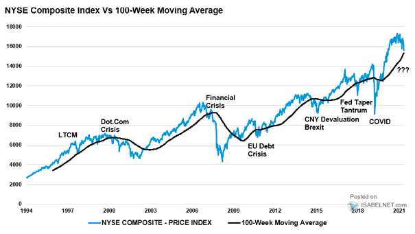
NYSE Composite Index vs. 100-Week Moving Average Could the NYSE Composite break its 100-week moving average to the downside significantly? Image: Real Investment Advice
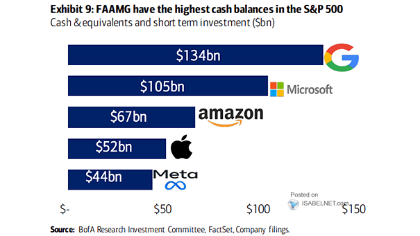
Stocks – Cash & Equivalent and Short Term Investment FAAMG have plenty of cash, which could be used to buyback shares or boost dividend payments. Image: BofA Research Investment Committee
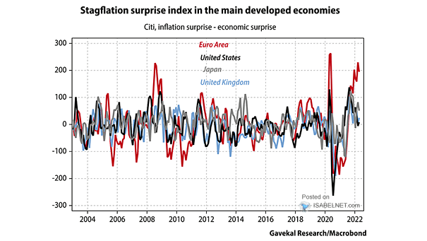
Inflation Surprise – Economic Surprise The risk of stagflation in the euro area is increasing significantly. Image: Gavekal, Macrobond
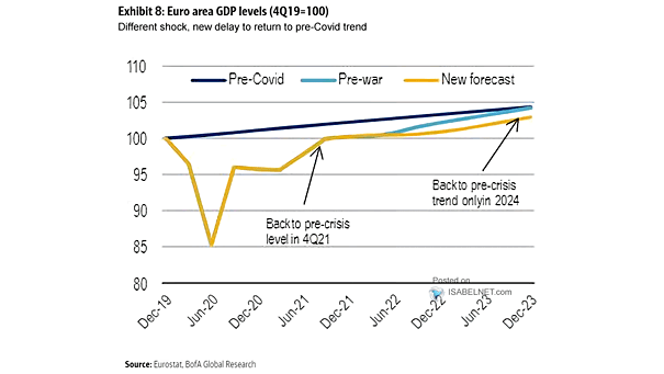
Euro Area GDP Forecasts When will euro area GDP reach the pre-crisis trend? Image: BofA Global Research
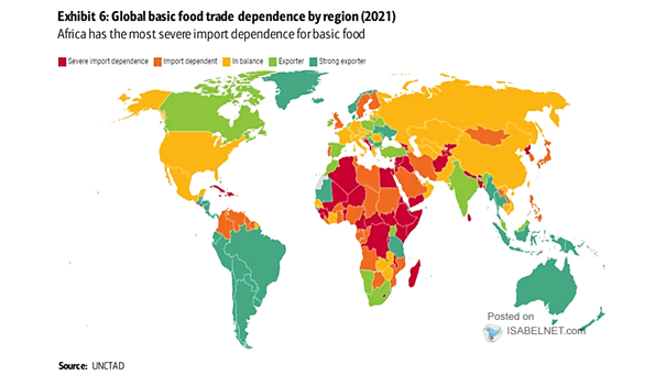
Global Basic Food Trade Dependence by Region Africa is highly dependent on imports of basic food. Image: BofA Global Research