Currency Markets and U.S. Elections
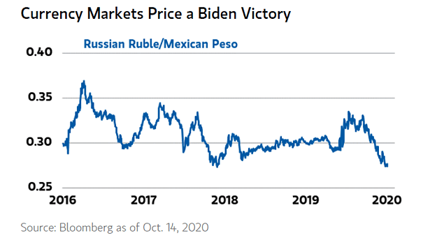
Currency Markets and U.S. Elections FX markets are pricing in a Biden presidency and a blue sweep as well. Image: Morgan Stanley Wealth Management
Currency Markets and U.S. Elections FX markets are pricing in a Biden presidency and a blue sweep as well. Image: Morgan Stanley Wealth Management
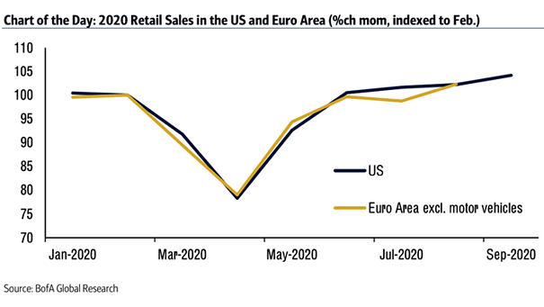
2020 Retail Sales in the U.S. and Euro Area This chart shows a sweet V-shaped recovery in U.S. and EU retail sales. Image: BofA Global Research
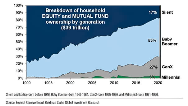
Breakdown of Household Equity and Mutual Fund Ownership by Generation Baby boomers control a substantial proportion of the U.S. equity market. Image: Goldman Sachs Global Investment Research
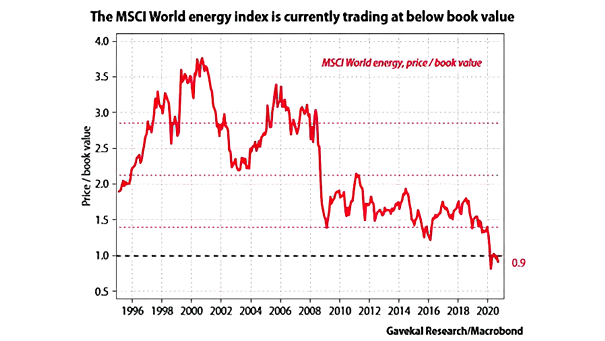
Energy Stocks – MSCI World Energy Index and Book Value Are energy stocks a buying opportunity? Image: Gavekal, Macrobond
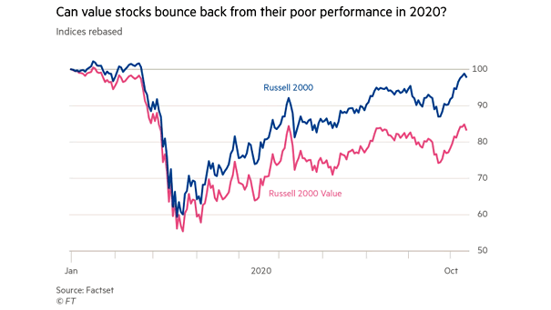
Value Stocks – Russell 2000 vs. Russell 2000 Value Can value stocks bounce back, as Value tends to outperform in the early stages of an economic recovery? Image: Financial Times
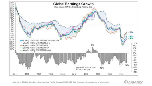
Global EPS – Global Earnings Growth This chart highlights the strong recovery in global earnings growth. Image: Fidelity Investments
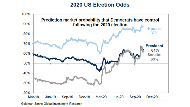
2020 U.S. Election Odds The odds of a “blue wave” of Democratic victories in the U.S. elections remain high. Image: Goldman Sachs Global Investment Research
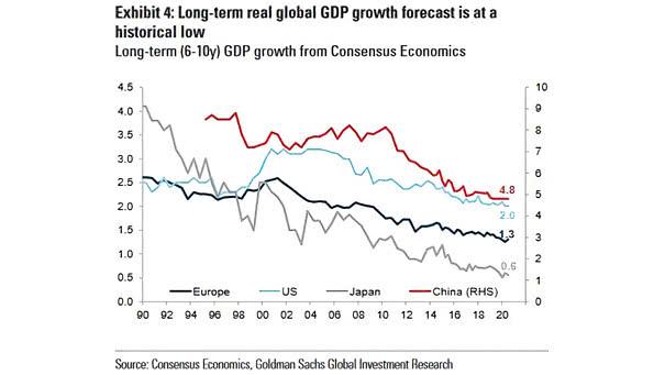
Long-Term (6-10y) Real Global GDP Growth Forecast from Consensus Economics Long-term (6-10y) real global GDP growth forecast continues to decline. Image: Goldman Sachs Global Investment Research
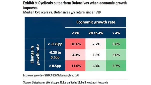
Median Cyclicals vs. Defensives YoY Return Since 1990 Cyclicals tend to outperform Defensives during periods of economic strength. Image: Goldman Sachs Global Investment Research
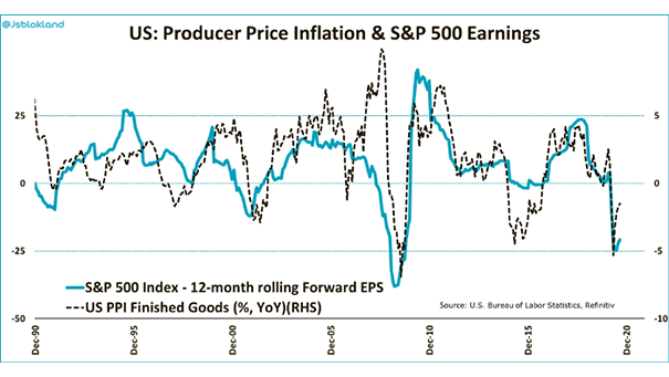
U.S. Producer Price Inflation and S&P 500 Earnings There is little doubt that the bottom in earnings is in for this cycle, as U.S. producer prices rose more than expected in September. Image: Jeroen Blokland
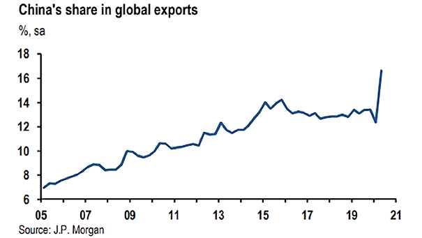
China’s Share in Global Exports With China leading the global economic recovery, China’s exports rose 9.9% YoY. Image: J.P. Morgan