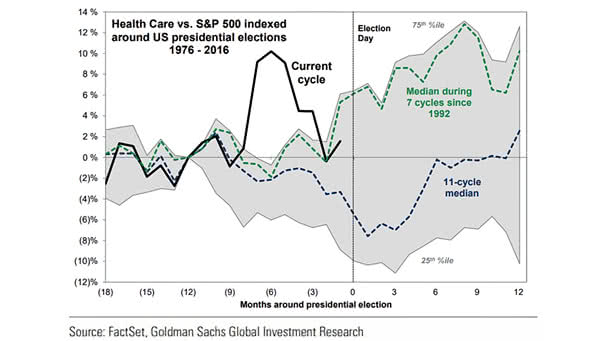
Health Care Sector Excess Returns vs. S&P 500 Around U.S. Presidential Elections
Health Care Sector Excess Returns vs. S&P 500 Around U.S. Presidential Elections The health care sector tends to underperform through U.S. presidential elections, due to uncertainty about future government policy. Image: Goldman Sachs Global Investment…