FMS Investors and Bull Market
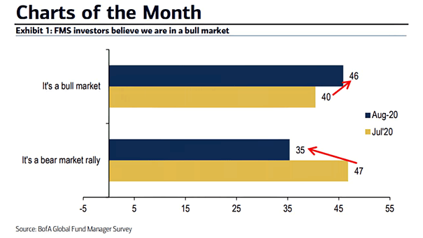
FMS Investors and Bull Market Net 46% of FMS investors say “it is a bull market”, no longer a “bear market rally” (35%). Image: BofA Global Fund Manager Survey
FMS Investors and Bull Market Net 46% of FMS investors say “it is a bull market”, no longer a “bear market rally” (35%). Image: BofA Global Fund Manager Survey
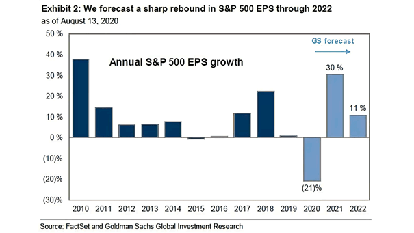
Annual S&P 500 EPS Growth Through 2022 Goldman Sachs expects S&P 500 earnings to contract by 21% this year, before rebounding by 30% in 2021 and 11% in 2022. Image: Goldman Sachs Global Investment Research
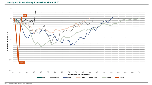
U.S. Real Retail Sales during 7 Recessions since 1970 The rebound in U.S. real retail sales is a V-shaped recovery, but can it last? Image: Pictet Asset Management
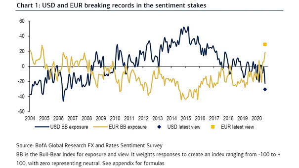
Sentiment – U.S. Dollar (USD) and Euro (EUR) The EU recovery fund provides more support for the euro. But is the reign of the U.S. dollar as the world’s reserve currency under threat? Image: BofA…
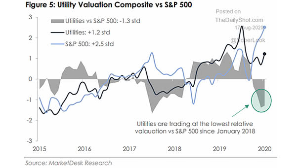
Utility Valuation Composite vs. S&P 500 Could utilities outperform the S&P 500? Image: MarketDesk Research
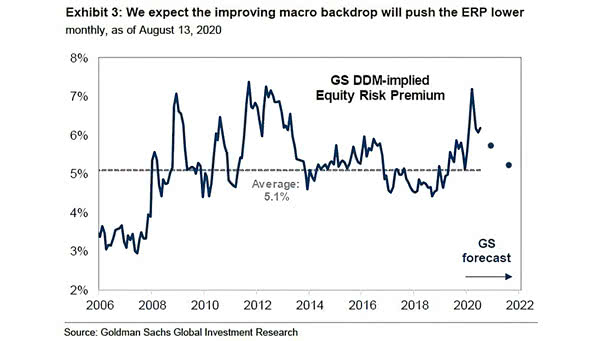
Dividend Discount Model (DDM) Implied Equity Risk Premium (ERP) Goldman Sachs expects the equity risk premium to be lower moving forward, as the macro backdrop strengthens. Image: Goldman Sachs Global Investment Research
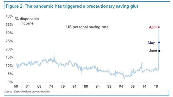
U.S. Personal Saving Rate Since 1959 Precautionary saving could weigh down on consumption. Image: Deutsche Bank
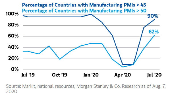
Percentage of Countries with Manufacturing PMIs Above 50 and 45 Manufacturing PMIs suggest that the worst is over in most countries. Image: Morgan Stanley Wealth Management
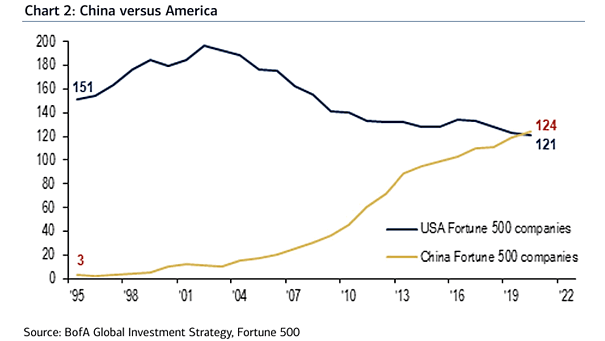
China vs. USA The number of Chinese companies in the Fortune Global 500 now exceeds that of the United States. Image: BofA Global Investment Strategy
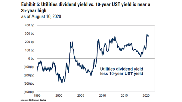
Utilities Dividend Yield Less 10-Year U.S. Treasury Yield Goldman Sachs upgraded utilities to outperform, as the utilities dividend yield is relatively high compared to the 10-year U.S. Treasury yield. Image: Goldman Sachs Global Investment Research
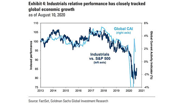
Performance – Industrials vs. S&P 500 and Global Current Activity Indicator (CAI) Goldman Sachs upgraded industrials to outperform, as global economic growth is improving. Image: Goldman Sachs Global Investment Research