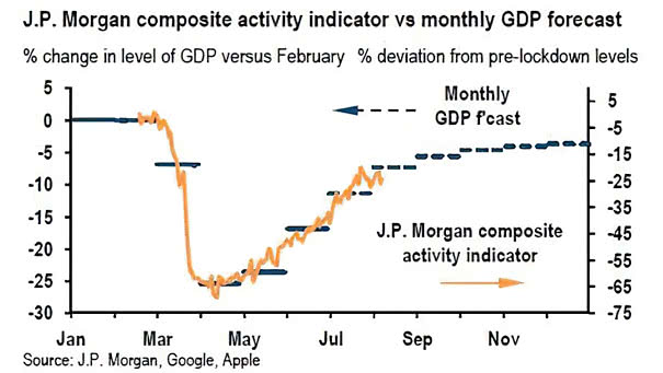
U.S. Labor Market Distributions Spider Chart
U.S. Labor Market Distributions Spider Chart The U.S. labor market distributions spider chart shows broad labor market developments. Image: Federal Reserve Bank of Atlanta
Number of Quarters of Real GDP Growth Lost This chart highlights the large gap between countries in terms of real GDP growth lost. Image: BofA Global Research
S&P 500 YoY EPS Growth Estimate Goldman Sachs has raised its 2020 S&P 500 EPS estimate from $115 to $130. Image: Goldman Sachs Global Investment Research
Gold Options-Implied Probability Distributions Option markets are quite bullish on gold. Image: Morgan Stanley Research
U.S. Household Debt and Credit Aggregate household debt balances declined by $34bn and stand at $14.27tn. This is the first decline since 2014. Image: Federal Reserve Bank of New York
Performance – Polarization Led by Tech If the S&P 500 was just the tech sector, it would be at 4015. Image: BofA Global Investment Strategy
U.S. Dividend Aristocrats Relative to S&P 500 and U.S. 10-Year Bond Yield Will the gap close between U.S. dividend aristocrats and U.S. bond yields? Image: J.P. Morgan
S&P 500 vs. Top 5 Stocks Does big tech present a risk for investors? Image: Financial Times
S&P 500 vs. Percentage of Stocks Above 50-Day Moving Average Chart showing the current divergence between the S&P 500 and the percentage of stocks trading above their 50-day moving average. Image: Fidelity Investments
Global Equity ETF Flows U.S. equity ETF flows remain strong amid the coronavirus turbulence. Image: J.P. Morgan
Gold Investment Physical Ex-Central Banks and Indices, of Equity Markets How much gold should an investor have in his investment portfolio? BofA suggests an optimized allocation to gold of approximately 4.5%. Image: BofA Global Research