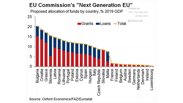
U.S. Average P/E Ratio and Inflation Range
U.S. Average P/E Ratio and Inflation Range This chart suggests that rising inflation is good for P/E until inflation exceeds 3%. Image: Credit Suisse Research
Crude Oil Forecasts Goldman Sachs expects oil prices to decline from current levels. Image: Goldman Sachs Global Investment Research
S&P 500 Market Cap/M2 Money Supply The S&P 500 market capitalization relative to M2 money supply suggests more upside. Image: Morgan Stanley Research
S&P 500 vs. Profit Margins Do valuations still matter? The current divergence between the S&P 500 and profit margins is huge. Image: Crescat Capital LLC
Job Losses During Recessions in the U.S. The March-May job loss is two times larger than the total GFC job loss. On the positive side, U.S. job losses see revival in May. Image: Oxford Economics
Advanced Economies GDP Growth According to Goldman Sachs, this is almost certainly the deepest and shortest recession since World War 2. Image: Goldman Sachs Global Investment Research
Performance for the Year: S&P 500, Nasdaq Composite and Dow Jones Industrial Average U.S. stocks climbed, erasing 2020 losses, as easing lockdowns boosts risk appetite. Image: Financial Times
U.S. Civilians Not In Labor Force To put things into perspective, there currently about 137 million employed workers in the United States, and 102 million Americans are not in the labor force. Image: Deutsche Bank…
S&P 500 vs. 60/40 Portfolio Since the valuation peak in january 2018, a 60/40 portfolio is up +7%, while the S&P 500 is flat. Image: Fidelity Investments
Valuation – Number of S&P 500 Members with 14 Day RSI Above 70 Market complacency is high, as the RSI level is getting into overbought condition for many S&P 500 stocks. Image: The Daily Shot