Insider Buy vs. Sell Ratio and S&P 500
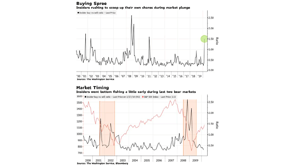
Insider Buy vs. Sell Ratio and S&P 500 Insider buying is at its highest level in nine years, but recent history shows that insiders tend to be early in picking the bottom. Image: Bloomberg
Insider Buy vs. Sell Ratio and S&P 500 Insider buying is at its highest level in nine years, but recent history shows that insiders tend to be early in picking the bottom. Image: Bloomberg
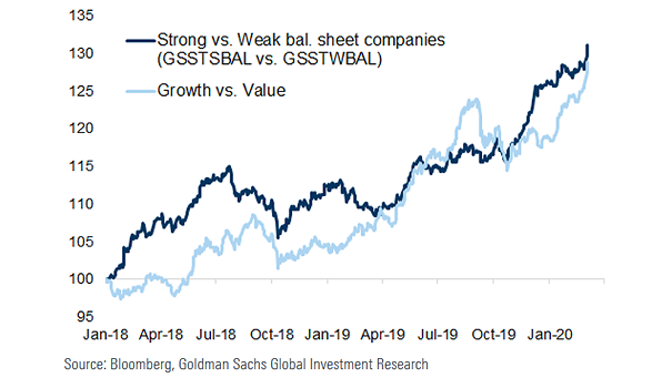
Strong vs. Weak Balance Sheet Companies and Growth vs. Value Chart showing the good correlation between strong vs. weak balance sheet companies and growth vs. value. Image: Goldman Sachs Global Investment Research
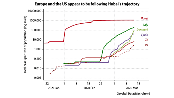
Coronavirus – Europe and U.S. vs. Hubei This chart suggests that coronavirus cases in Europe and the U.S. are following Hubei’s trajectory. A turning point is not expected rapidly. Image: Gavekal, Macrobond
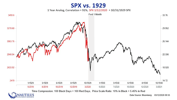
S&P 500 vs. 1929 This chart comparing the S&P 500 to 1929, shows a 91% correlation currently (intended for informational purposes only). Image: Nautilus Research
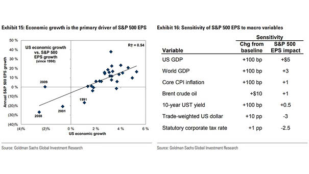
U.S. Economic Growth vs. S&P 500 EPS Growth This chart shows the link between economic growth and S&P 500 EPS growth, and highlights the sensitivity of S&P 500 EPS to macro variables. Image: Goldman Sachs…
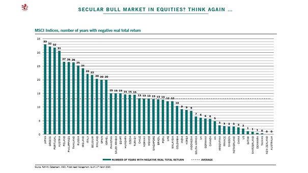
Secular Bull Market In Equities: MSCI Country Indices and Number of Years with Negative Real Total Return 60% of MSCI country indices have posted negative real return over the past 10 years. Image: Pictet Asset…
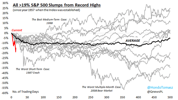
All > 19% S&P 500 Slumps From Record Highs This chart shows all historical S&P500 slumps from record highs since 1957. Image: Hondo Tomasz
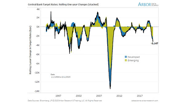
Central Bank Target Rates Who will be the next central bank to cut interest rates? Central banks have cut -3,147 basis points over the past year. Image: Arbor Research & Trading LLC
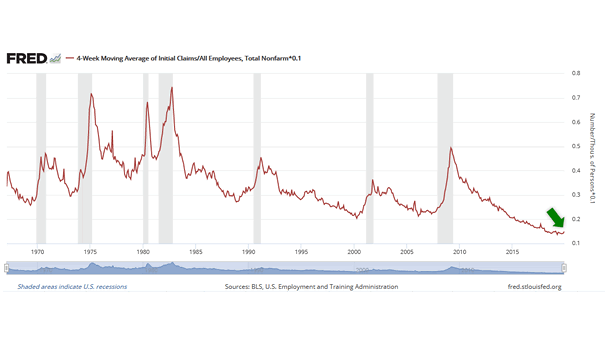
What Is the Probability of Being Unemployed in a Given Month in the United States? Weekly initial jobless claims decreased to 202,000. Currently, by dividing the average initial claims for unemployment insurance by the total…
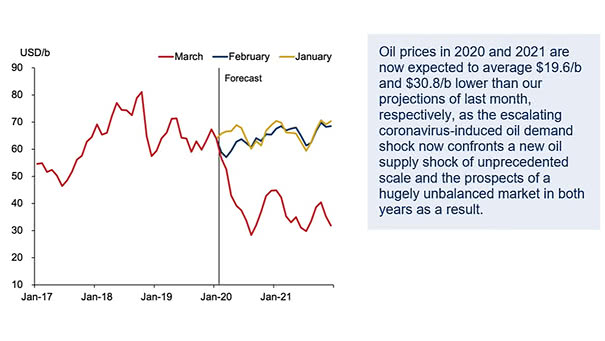
Oil Prices Forecast for 2020 and 2021 Chart suggesting $42.6 per barrel for 2020 and $35.9 per barrel for 2021. Image: Oxford Economics
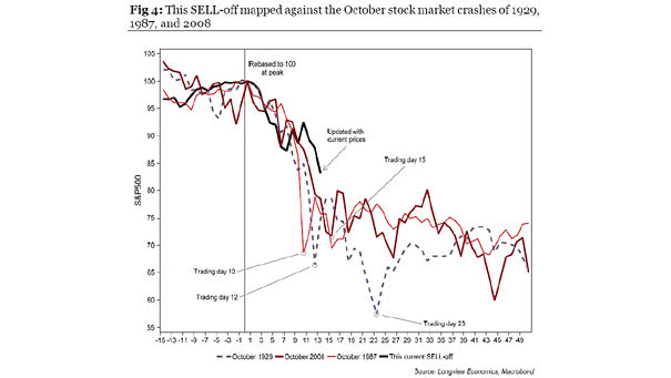
S&P 500 Current Sell-off vs. October Stock Market Crashes of 1929, 1987, and 2008 Chart suggesting that the current sell-off is consistent with the historic crashes of 1929, 1987, and 2008. Image: Longview Economics