Global Investment Research Financial Excess Monitor and Recessions
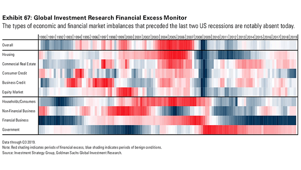
Global Investment Research Financial Excess Monitor and Recessions The heat map suggests below-average imbalances in the U.S. economy. Image: Goldman Sachs Global Investment Research
Global Investment Research Financial Excess Monitor and Recessions The heat map suggests below-average imbalances in the U.S. economy. Image: Goldman Sachs Global Investment Research
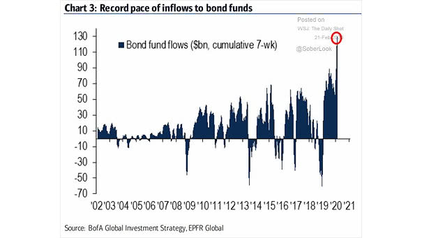
Bond Fund Flows Bond funds hit inflow record, reflecting investor fears about the coronavirus’s spread. Image: BofA Global Investment Strategy
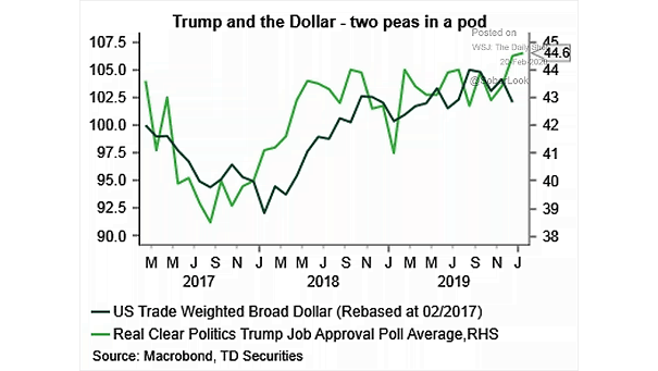
U.S. Dollar and President Trump This chart shows the correlation between the U.S. dollar and President Trump’s approval ratings Image: TD securities
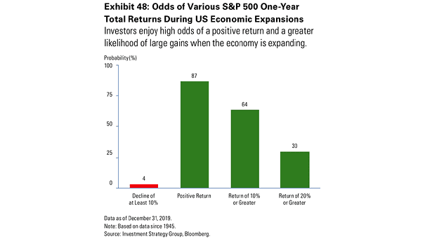
Odds of Various S&P 500 One-Year Total Returns During U.S. Economic Expansions This chart suggests the probability of positive one-year market returns when the U.S. economy is expanding. Image: Investment Strategy Group, Bloomberg
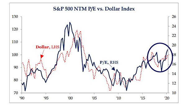
S&P 500 Next Twelve Months P/E vs. Dollar Index This chart suggests that the strength of the U.S. dollar supports higher P/E multiples for the S&P 500. Image: Strategas
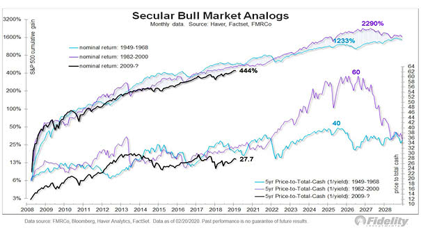
S&P 500 – Secular Bull Market Analogs The bull market that began in 2009 could have similarities with the secular bull markets of 1982-2000 and 1949-1968. Since the Great Recession, US stocks have behaved like…
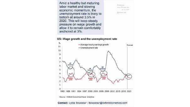
U.S. Wage Growth and U.S. Unemployment Rate Has U.S. wage growth peaked? This chart suggests that the U.S. unemployment rate could bottom out at around 3.5% this year. Image: Oxford Economics
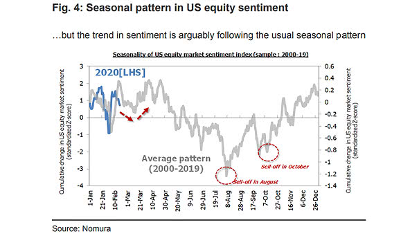
Seasonality of U.S. Equity Market Sentiment Index This chart puts into perspective the seasonal pattern in U.S. equity sentiment. Image: Nomura
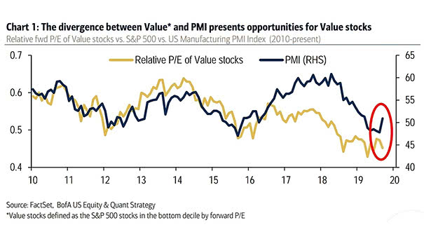
Relative P/E of Value Stocks vs. S&P 500 vs. U.S. Manufacturing PMI Index BofA remains bullish on value stocks in the coming months, due to improving macro conditions. Image: BofA U.S. Equity and Quant Strategy
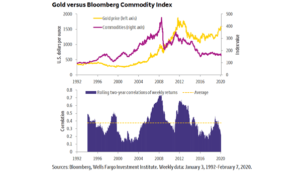
Gold Prices vs. Commodities The declining correlation between the price of gold and commodities may suggest that the commodity bear super-cycle is nearing its end. Image: Wells Fargo Investment Institute
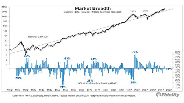
U.S. Market Breadth At the dotcom bubble peak, the percentage of stocks outperforming the S&P 500 was 27% vs. 42% today (the historical average is 48%). Currently, the relative market breadth isn’t as extreme as…