
MSCI Emerging Markets Relative to the U.S. and U.S. Dollar
MSCI Emerging Markets Relative to the U.S. and U.S. Dollar Historically, a weak U.S. dollar tends to be good for emerging markets relative to the U.S.. Image: Datastream, J.P. Morgan
MSCI Emerging Markets Relative to the U.S. and U.S. Dollar Historically, a weak U.S. dollar tends to be good for emerging markets relative to the U.S.. Image: Datastream, J.P. Morgan
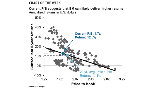
Emerging Market Price-to-Book and Subsequent 5-Year Returns This chart shows the correlation between EM price-to-book and subsequent 5-year returns, suggesting higher returns for emerging markets. Image: J.P. Morgan
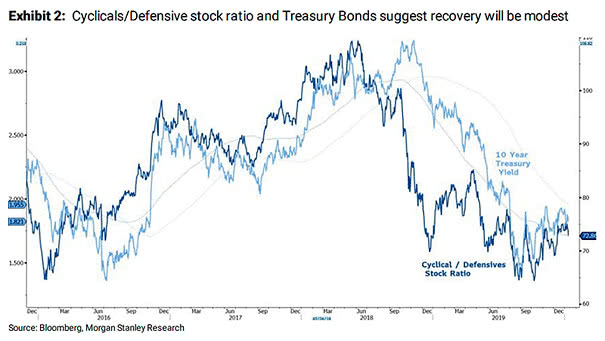
Cyclicals to Defensive Stock Ratio and Treasury Bonds Market internals, the preference for large over small and quality over junk, suggest that the recovery will be modest. Image: Morgan Stanley Research
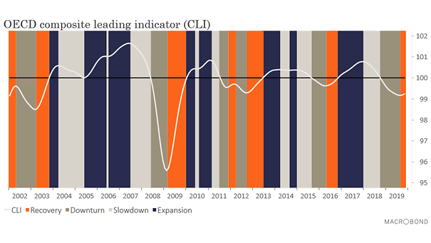
Global Economy – OECD Composite Leading Indicator (CLI) The OECD Composite Leading Indicator (CLI) is rising and suggests that a global economic recovery is underway. Image: Macrobond
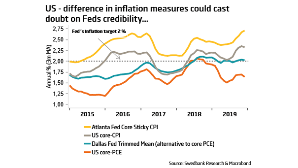
Difference in U.S. Inflation Measures PCE and CPI diverge, suggesting that PCE may be understimated. Image: Swedbank Research
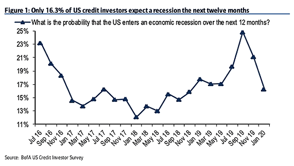
What is the Probability that the U.S. Enters an Economic Recession over the Next 12 Months? The latest edition of BofA’s US credit investor survey shows that recession fears have dropped to 16.3%. Image: BofA…
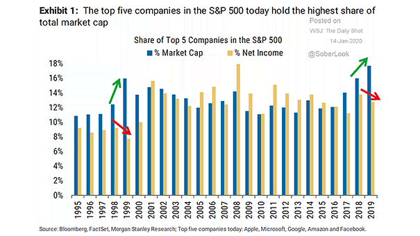
Share of Top 5 Companies in the S&P 500 The S&P 500 has become abnormally concentrated, creating a certain vulnerability. Image: Morgan Stanley Research

1920s and 1990s Bull Markets vs. Current Bull Market Chart showing that there is no “blow off top” in the current bull market, compared to 1920s and 1990s bull markets. Image: Stifel
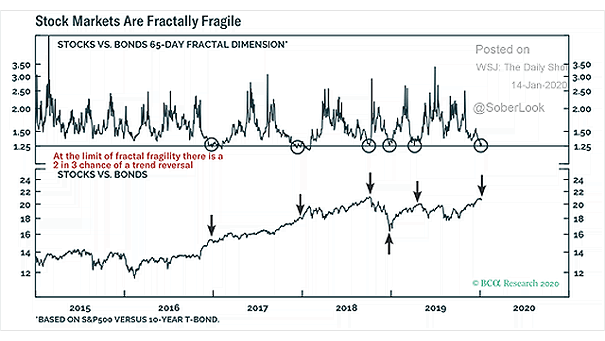
Valuation – S&P 500 vs. 10-Year Treasury Bond This chart suggests that there is a 2 in 3 chance of a trend reversal, as the S&P 500 looks overbought vs. the 10-year Treasury bond. Image:…
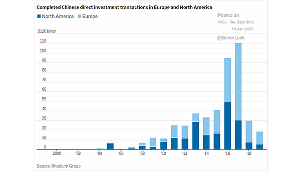
Completed Chinese Direct Investment Transactions in Europe and North America Chinese investments in Europe and North America fell again last year. Is it over? Image: The Wall Street Journal
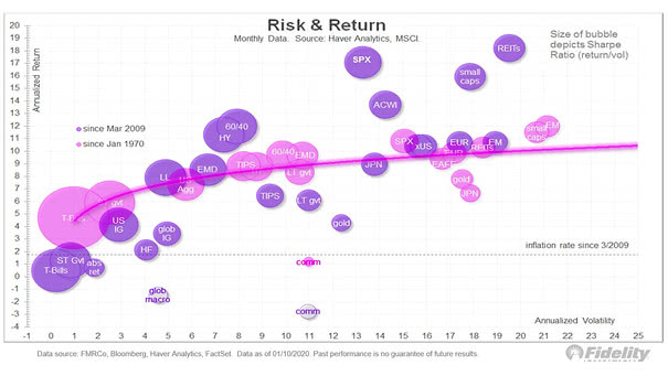
Risk & Return, and Sharpe Ratio This chart shows risk and return since 1970 and since the 2009 low, including the Sharpe ratio. Image: Fidelity Investments