Value Stocks vs. Low Volatility Stocks
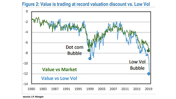
Value Stocks vs. Low Volatility Stocks Chart showing the large divergence between value stocks and low volatility stocks, like never before. Image: J.P. Morgan
Value Stocks vs. Low Volatility Stocks Chart showing the large divergence between value stocks and low volatility stocks, like never before. Image: J.P. Morgan
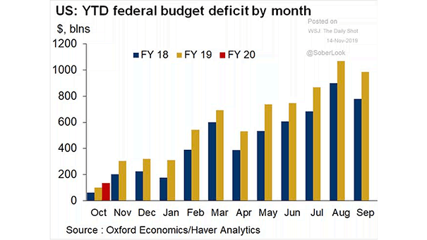
U.S. Federal Budget Deficit by Month U.S. federal budget deficit surges to $134.5 billion in October. Image: Oxford Economics
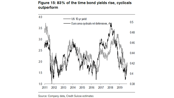
U.S. 10-Year Treasury Yield and Euro Area Cyclicals Relative to Defensives Chart suggesting that euro area cyclicals outperform defensives, when U.S. bond yields rise. Image: Credit Suisse Research
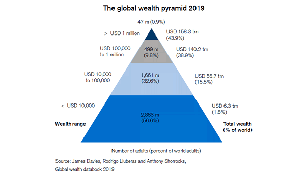
Inequality – The Global Wealth Pyramid The level of wealth inequality is high in 2019: the richest 10% of adults own 82% of global wealth, while the bottom half of adults account for less than…
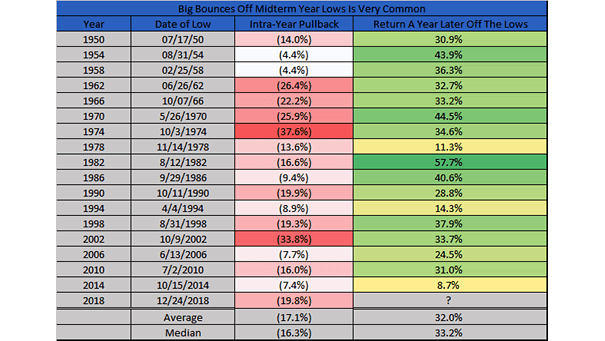
S&P 500 Return A Year Later Off The Midterm Election Lows A year after the midterm lows, the S&P 500 is up 32% on average. History also shows that the S&P 500 has been higher…
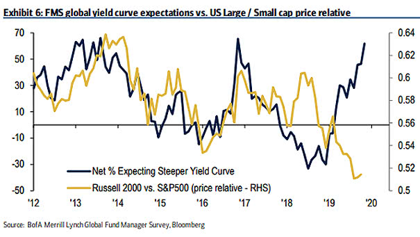
FMS Global Yield Curve Expectations vs. U.S. Large/Small Cap Price Relative History suggests that U.S. small cap stocks outperform large cap stocks, when the yield curve steepens. Image: BofA Merrill Lynch Global Fund Manager Survey
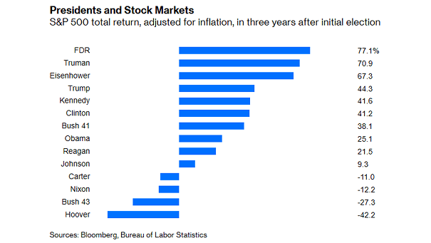
S&P 500 Total Return, Adjusted for Inflation, in Three Years After Initial Election The stock market performance, adjusted for inflation, in first three years since Trump’s election is quite good. Image: Bloomberg
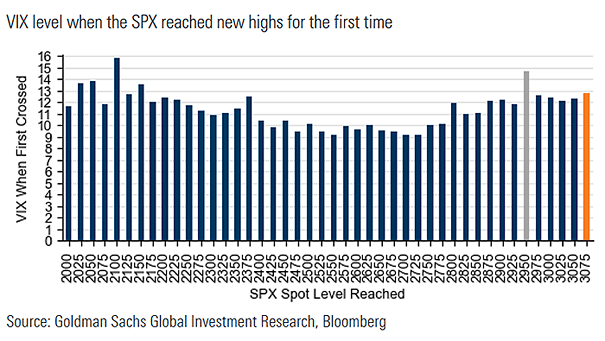
VIX Level and S&P 500 New Highs The VIX level when the S&P 500 reached new highs for the first time is rising. Image: Goldman Sachs Global Investment Research
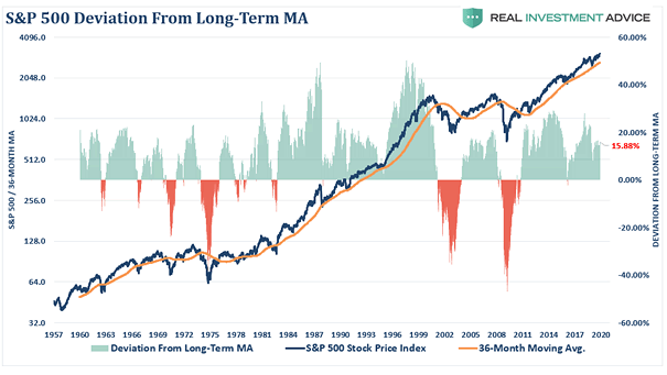
Valuation – S&P 500 Deviation From Long-Term Moving Average Interesting chart showing that the S&P 500 is currently more than 15% above its 3-year moving average. Image: Real Investment Advice
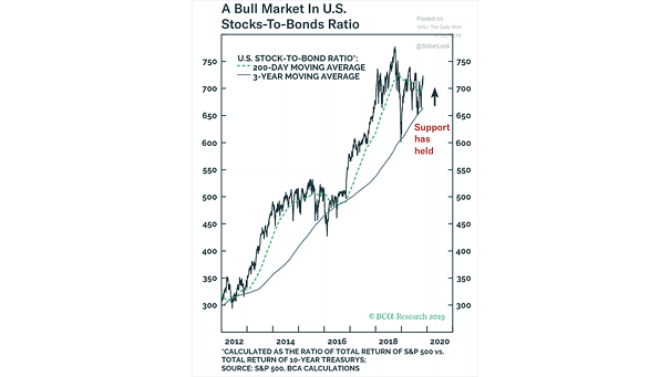
Bull Market – U.S. Stocks-to-Bonds Ratio Chart showing the bull market in the U.S. stocks-to-bonds ratio. So far, the long-term support has held well. Image: BCA Research
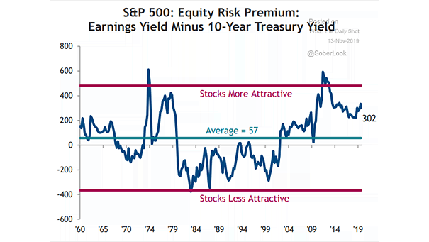
S&P 500 Equity Risk Premium: Earnings Yield Minus 10-Year Treasury Yield Chart suggesting that the S&P 500 equity risk premium looks attractive. Image: Truist