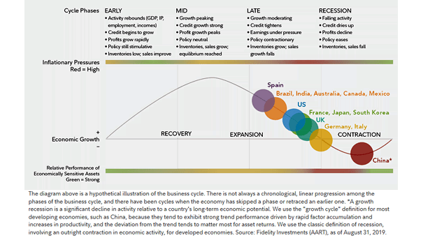
Stages of the Business Cycle as of August 31, 2019
Stages of the Business Cycle as of August 31, 2019 This chart suggests that most major economies are in the late phase of the business cycle. Image: Fidelity Investments
Stages of the Business Cycle as of August 31, 2019 This chart suggests that most major economies are in the late phase of the business cycle. Image: Fidelity Investments
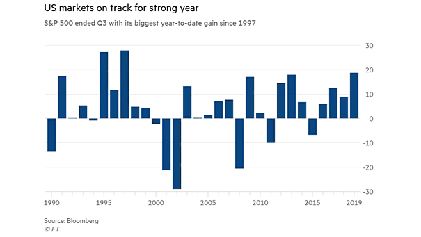
Annual S&P 500 Return Since 1990 Currently, the S&P 500 Index has its best year since 1997. Image: Financial Times
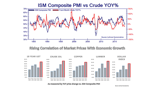
ISM Composite PMI vs. Crude Oil Interesting chart showing that the correlation between the ISM Composite PMI and crude oil is up to 75% since 2015. Image: Lohman Econometrics
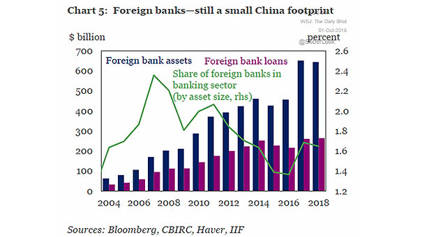
Foreign Bank Assets and Loans in China This interesting chart shows that foreign banks have a very small footprint in China. Image: Institute of International Finance
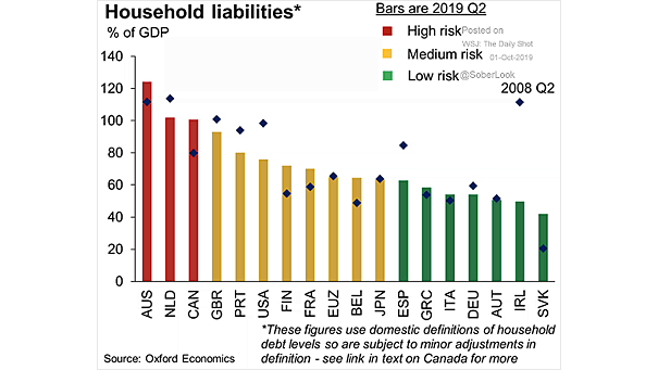
Household Debt to GDP by Country This chart shows a global view of household debt as a percent of GDP. Households of Australia, Netherlands and Canada are the most indebted in the world. Image: Oxford…
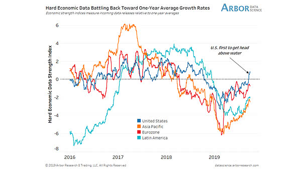
Hard Economic Data Hard economic data is improving in Eurozone, Asia Pacific, Latin America and the United States. Image: Arbor Research & Trading
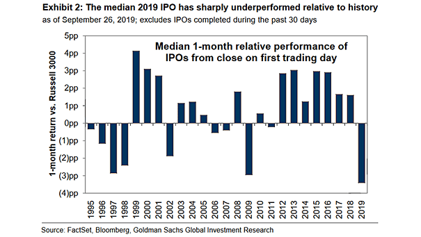
IPO Relative Performance in 2019 The IPO market is suffering in 2019. This year’s IPO class is one of the least profitable. Image: Goldman Sachs Global Investment Research
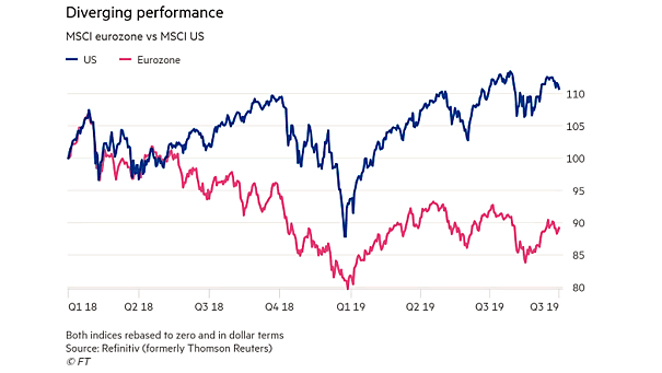
MSCI Eurozone vs. MSCI U.S. This chart shows the large divergence between the MSCI Eurozone Index and the MSCI U.S. Index. Is this an opportunity to increase exposure to eurozone equities? Image: Financial Times
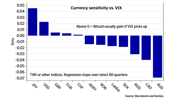
Currency Sensitivity vs. VIX If VIX spikes, this chart suggests that investors should be long yen. Image: Nordea and Macrobond
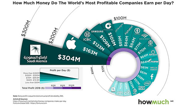
World’s Most Profitable Companies Saudi Aramco remains by far the most profitable company in the world. Image: howmuch.net
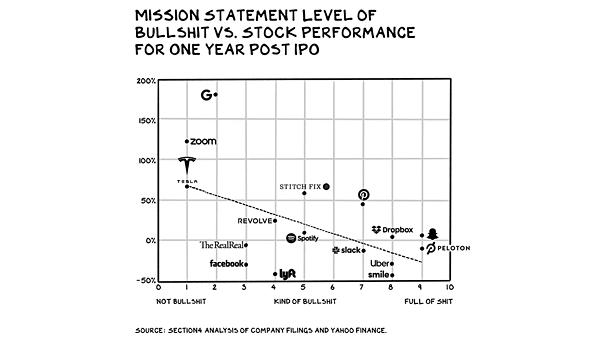
Mission Statement Level of Bullshit vs. Stock Performance from One Year Post IPO This chart suggests that the level of bullshit in the mission statement seems to be inversely correlated to the stock performance from…