The Drawdowns of 2018-2019
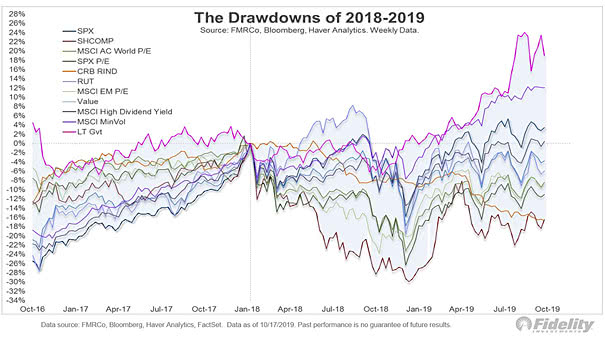
The Drawdowns of 2018-2019 This nice chart shows another good way to measure drawdowns, by looking at valuations and measuring time. Image: Fidelity Investments
The Drawdowns of 2018-2019 This nice chart shows another good way to measure drawdowns, by looking at valuations and measuring time. Image: Fidelity Investments
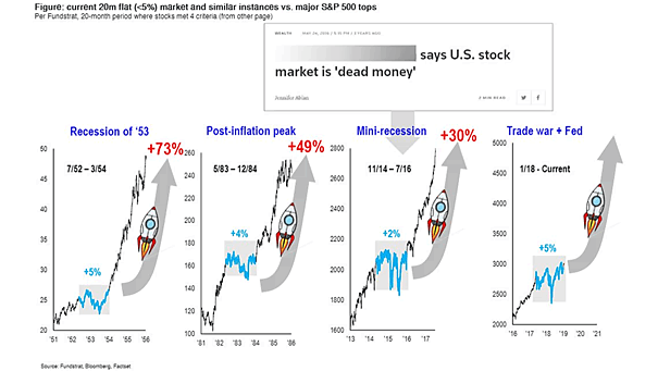
Current 20-Month Flat Market vs. Major S&P 500 Tops Since World War II, the U.S. stock market went nowhere three times in the last 20 months. If history repeats itself, it could make an upside breakout. Image: Fundstrat Global Advisors, LLC
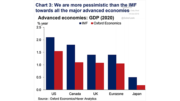
Advanced Economies – Global GDP Forecast for 2020 Oxford Economics thinks that IMF’s new global GDP growth forecasts for 2020 are too optimistic. Image: Oxford Economics
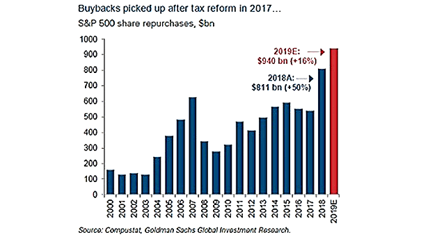
Stock Buybacks Since 2000 Thanks to tax cuts and low interest rates, the stock market should get around $1 trillion boost via buybacks this year. Image: Goldman Sachs Global Investment Research
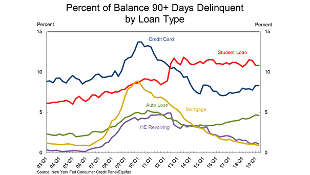
Delinquency Rate of Student Loans since 2003 The delinquency rate of student loans is higher than credit card delinquency, auto loans and mortgages. The main reason is that the interest rate on student loans can be very high. Image: Federal Reserve Bank of New York
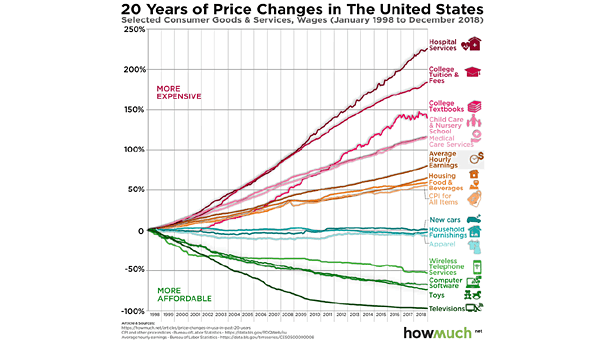
Inflation – Price Changes Over the Last 20 Years in the U.S. Most important things in life are getting more expensive, while toys are getting more affordable. Image: howmuch.net
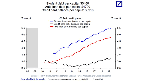
U.S. Student Debt, Auto Loan Debt, Credit Card Balance, per Capita Household debt balances have been rising steadily in recent years. Image: Deutsche Bank Global Research
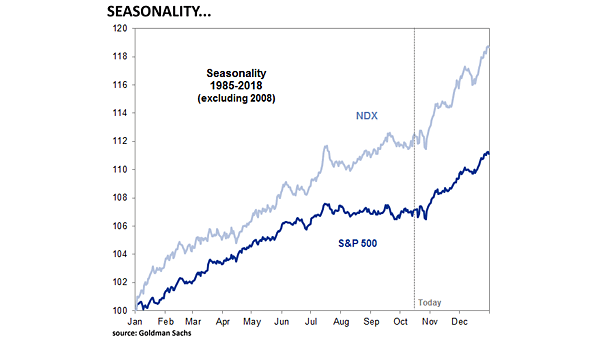
Nasdaq 100 and S&P 500 Seasonality The Nasdaq 100 and S&P 500 seasonality chart from 1985 to 2018 (excluding 2008). This is not a forecast. Image: Goldman Sachs
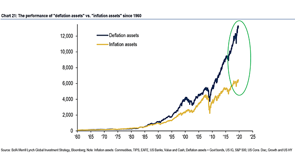
The Performance of “Deflation Assets” vs. “Inflation Assets” Interesting chart showing the performance of “Deflation Asset” vs. “Inflation Assets” since 1960. “Deflation Assets”: Government Bonds, US Investment Grade, S&P 500, US Consumer Discretionary, Growth and US High Yield “Inflation Assets”: TIPS, EAFE, US Banks, Value and Cash Image: BofA Merrill Lynch
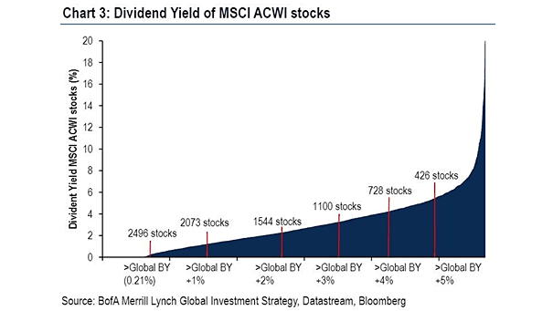
Dividend Yield of MSCI ACWI Stocks Currently, more than 1,100 global stocks are paying dividends above the average yield of global government bonds. Image: BofA Merrill Lynch
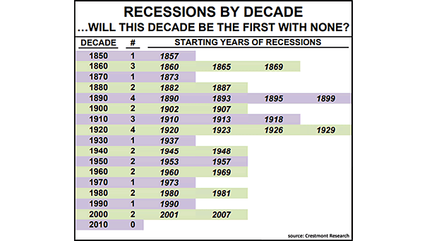
U.S. Recessions by Decade This could be the first decade in history wherein the U.S. economy doesn’t experience a recession. Image: Crestmont Research