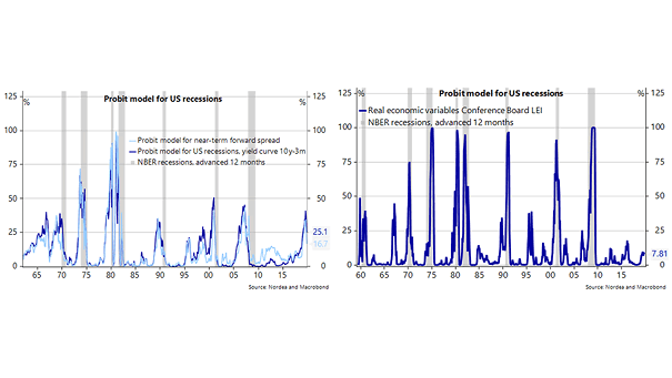
Dow New All-Time Highs Per President
Dow New All-Time Highs Per President Interesting chart showing that Dow new all-time highs have varied significantly under each president. Image: Ryan Detrick, LPL Financial LLC Click the Image to Enlarge
The Cost of a Comfortable Living in the United States This map shows how long Americans need to work to enjoy a comfortable life. Image: howmuch.net Click the Image to Enlarge
ISM Manufacturing PMI and Nonfarm Payroll Growth vs. U.S. Election Outcome Chart showing the relationship between growth trends into U.S. elections and the margin of victory or defeat for incumbent candidates. Historically, the probability of incumbents winning an election increases, as growth trends improve. Image: Bessemer Trust
S&P 500 Industrials Index and U.S. Manufacturing Unit Labor Costs When U.S. labor costs rise, industrial profit margins are under pressure. Image: Quill Intelligence, LLC
S&P 500 New All-Time Highs Per Year This year has the second most new highs ever. New all-time highs can last more than 10 years and tend to occur in clusters. Image: Ryan Detrick, LPL Financial LLC Click the Image to Enlarge
S&P 500 Forward 10 Year Returns Charts suggesting that S&P 500 returns will be weak for the next 10 years. Image: Pervalle Global Click the Image to Enlarge
Global Nominal GDP and Corporate Profits This chart shows the correlation and the slowdown in global growth and corporate profits. Historically, margin pressures have preceded the start of recessions. Image: J.P. Morgan
Impact of an Inverted Yield Curve: S&P 500 and U.S. Dollar History tells us that the U.S. dollar and the S&P 500 could go higher, and the yield curve could stay inverted until mid-2020. Image: Nordea and Macrobond Click the Image to Enlarge
U.S. Initial Unemployment Claims and U.S. GDP There is a pretty good correlation between U.S. initial unemployment claims and U.S. GDP. Initial unemployment claims could suggest an acceleration of U.S. GDP in Q3 2019. Click on the Image to Enlarge
World Population in 2018 Interesting world map: the country’s size represents the size of the population. You may also like “World Population & Demographics – More People Over 65 than Under 5 for the First Time.” Image: Our World in Data Click the Image to Enlarge
Industrial Search Trends Looking Optimistic This chart shows the rise in search interest in the U.S.. That’s good news after a fall in 2018, because industrial search trends tend to lead realized growth by a decent margin. Image: Arbor Research & Trading LLC