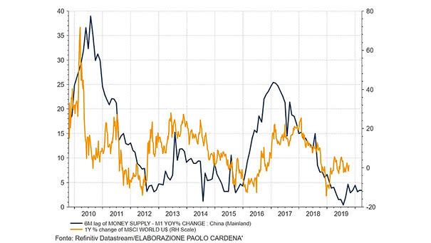
China M1 Money Supply Growth Leads MSCI World Index
China M1 Money Supply Growth Leads MSCI World Index Chart suggesting that China M1 money supply growth leads the MSCI World Index by 6 months. Image: Paolo Cardena
China M1 Money Supply Growth Leads MSCI World Index Chart suggesting that China M1 money supply growth leads the MSCI World Index by 6 months. Image: Paolo Cardena
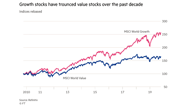
MSCI World Growth Index vs. MSCI World Value Index Over the past decade, global value stocks have remained in the shadow, while the sun has shone on global growth stocks. Image: Financial Times

MSCI World Index vs. OECD Unemployment Rate and U.S. Consumer Confidence Chart suggesting that OECD unemployment troughs and very confident U.S. consumers do not generally bode well for global equities. Image: Morgan Stanley Research
Dividend Yield of MSCI ACWI Stocks Currently, more than 1,100 global stocks are paying dividends above the average yield of global government bonds. Image: BofA Merrill Lynch
MSCI World Index Valuation at Cycle Peaks and Troughs On average, the MSCI World Index currently trades at a price-to-earnings ratio that has marked cyclical peaks in the stock market over the past 50 years. Image: Charles Schwab
Currency Impact on International Returns (MSCI ACWI ex-U.S.) Chart showing the currency impact on the MSCI All Country World ex-U.S. Index. Image: J.P. Morgan Asset Management
MSCI Eurozone vs. MSCI U.S. This chart shows the large divergence between the MSCI Eurozone Index and the MSCI U.S. Index. Is this an opportunity to increase exposure to eurozone equities? Image: Financial Times
Global Manufacturing PMI and MSCI Global Auto Index This chart shows the pretty good correlation between Global Manufacturing PMI and the MSCI Global Auto Index (YoY change). Image: J.P. Morgan
S&P 500 vs. MSCI Emerging Markets Index This chart shows the strong performance of the S&P 500 against the MSCI Emerging Markets Index. Image: Financial Times
Relative Performance of MSCI World Factors In the last two weeks, the shift to value stocks may indicate that investors expect rates to rise. Image: Financial Times
Median MSCI World Index vs. Its Seasonal Pattern This chart shows when the median MSCI World Index tends to perform better or worse at certain times of the year. Image: J.P. Morgan