Copper YoY Change vs. ISM New Orders YoY Change
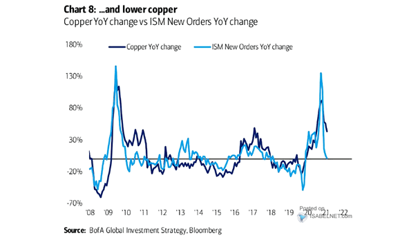
Copper YoY Change vs. ISM New Orders YoY Change ISM new orders trends point to a decline in copper prices. Image: BofA Global Investment Strategy
Copper YoY Change vs. ISM New Orders YoY Change ISM new orders trends point to a decline in copper prices. Image: BofA Global Investment Strategy
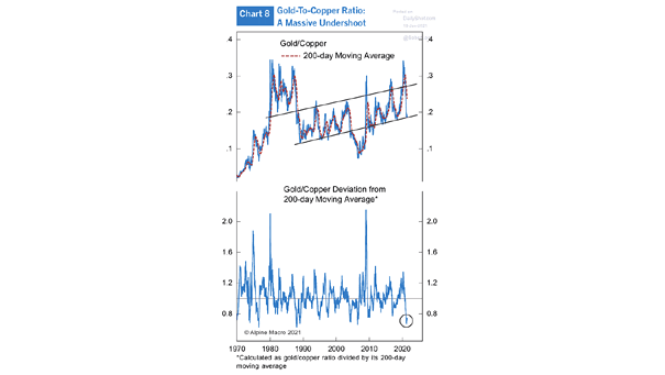
Gold to Copper Ratio The gold-to-copper ratio is a reliable barometer of global economic health. Image: Alpine Macro

Copper and Gold – Rolling 6-Month Performance Copper prices are rising on a strong demand outlook and gold’s underperformance is a rotation into risky assets. Image: MarketDesk Research
CTAs’ Net Position in CMX Copper Futures vs. the CMX Copper Futures Price CTAs’ net long positions in copper are very bullish. Image: Nomura
Copper Prices Relative to Gold Prices Copper looks cheap relative to gold. Image: Longview Economics
Performance vs. S&P 500 MSCI Emerging Market Equity Index and Copper The rebound in copper prices could suggest strong emerging market performance. Image: Morgan Stanley Research
Copper to Gold Ratio vs. ISM Manufacturing PMI The ISM manufacturing PMI suggests a higher copper to gold ratio. Image: Alpine Macro
China Copper Import Volume The rise in copper demand suggests a robust recovery. Image: Morgan Stanley Wealth Management
Copper to Gold Ratio and U.S. 10-Year Bond Yield The copper to gold ratio suggests higher bond yields. Image: Pictet Asset Management
China 10-Year Yield and Copper to Gold Ratio Chart showing the weekly correlation between China 10-year yield and the copper to gold ratio (R² = 0.58). Image: Bloomberg
Global Industrial Cycle and Copper vs. Equities Chart suggesting that copper should outperform equities in a global industrial rebound. Image: Oxford Economics