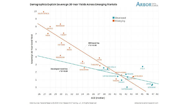
Demographics Explain Sovereign 30-Year Yields Across Emerging Markets

Demographics Explain Sovereign 30-Year Yields Accross Emerging Markets Another great chart showing that emerging market demographics explain 30-year sovereign bond yields. An R² of 0.80 is quite high and significant. You may also like “U.S. Population Growth vs. U.S. 10-Year Treasury Bond Yield.” Image: Arbor Research & Trading LLC

Debt and Demographics

Debt and Demographics Our world is aging with high levels of debt and low interest rates (maybe for a long time). Image: Fidelity Investments

Price Relative of MSCI World vs. Emerging Markets ex-China

Price Relative of MSCI World vs. Emerging Markets ex-China Emerging markets ex-China benefit from modernization potential, favorable demographics, and attractive valuations for the long term, according to BofA. Image: BofA Global Research

Valuation Gap Between U.S. and Emerging Markets ex-China

Valuation Gap Between U.S. and Emerging Markets ex-China According to BofA, emerging markets ex-China benefit from favorable demographics, modernization potential, and attractive valuations for the long term. Image: BofA Global Research

Japan – Explaining 10-Year Yields

Japan – Explaining 10-Year Yields Great chart suggesting that demographics explain Japan’s 10-year yields. An R² of 0.87 is quite high and significant. Image: Arbor Research & Trading LLC

Germany – Explaining 10-Year Bund Yields

Germany – Explaining 10-Year Bund Yields This great chart suggests that demographics explain Germany’s 10-year bund yields. An R² of 0.87 is quite high and significant. Image: Arbor Research & Trading LLC

USA – Explaining 10-Year Yields

USA – Explaining 10-Year Yields This great chart suggests that demographics and globalization explain U.S. 10-year yields. Image: Arbor Research & Trading LLC

U.S. Labor Force vs. Inflation

U.S. Labor Force vs. Inflation The chart shows the enduring link between labor force and inflation. The chart also suggests that U.S. labor force leads U.S. CPI by three years. Demographic trends imply subdued inflation. You may also like “World Population & Demographics – More People Over 65 than Under 5 for the First Time.”…

U.S. Population Growth vs. U.S. 10-Year Treasury Bond Yield

U.S. Population Growth vs. U.S. 10-Year Treasury Bond Yield U.S. demographics explain the 10-year Treasury bond yield, due to low inflation. The U.S. 10-year bond yield reflects inflation and growth expectations, and working age population growth contributes to inflation and GDP growth. Image: Paolo Cardena

World Population in 2018

World Population in 2018 Interesting world map: the country’s size represents the size of the population. You may also like “World Population & Demographics – More People Over 65 than Under 5 for the First Time.” Image: Our World in Data Click the Image to Enlarge