Demographics – IMF World Gross National Savings as a Percent of GDP
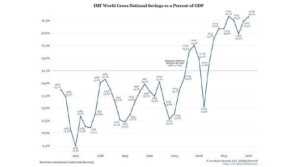
Demographics – IMF World Gross National Savings as a Percent of GDP Aging populations may well boost savings. This chart is a very good illustration. Image: Bianco Research
Demographics – IMF World Gross National Savings as a Percent of GDP Aging populations may well boost savings. This chart is a very good illustration. Image: Bianco Research
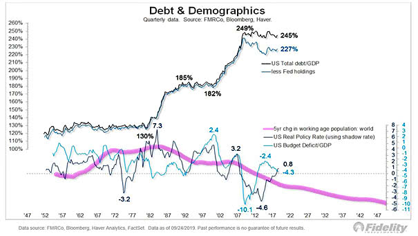
U.S. Debt and Demographics This interesting chart clearly shows the large divergence between U.S. debt and demographics. Image: Fidelity Investments

Demographics and Interest Rates Interesting chart suggesting that demographics explain bond yields. Image: Fidelity Investments
Demographics and U.S. 10-year Treasury Yield The trend in global savings has turned. The chart suggests that the dis-saving phase is likely to be inflationary. Image: Gavekal, Macrobond
Demographics – U.S. Population Aging and Pension Demand for Bonds This chart suggests that U.S. pension demand for bonds is going to increase, as the proportion of 65+ rises. Image: Oxford Economics, Macrobond
Demographics – Dow Jones and Generational Peaks This chart shows that generational peaks are associated with major market tops. GenX peaked in 2018 and Millennials don’t peak until 2038. Image: Fundstrat Global Advisors, LLC
Demographics – Forecasting U.S. GDP This chart suggests that aging population is weighing down growth. Image: Arbor Research & Trading LLC
Demographics – Old Age Dependency Ratio The world’s population is ageing and demographics explain low interest rates. Image: Arbor Research & Trading LLC
Demographics – Older Societies Have Lower Inflation This interesting chart shows again that an aging population leads to lower inflation (R² = 0.45). Image: Oxford Economics
Valuation and Demographics Our world is aging with high levels of debt and low interest rates, maybe for a long time. The chart shows that an aging population affects yields. You may also like “Debt and Demographics.” Image: Fidelity Investments
World Population & Demographics – More People Over 65 than Under 5 for the First Time This chart suggests that declining fertility rates lead to an aging population and secular stagnation. Image: Deutsche Bank Global Research