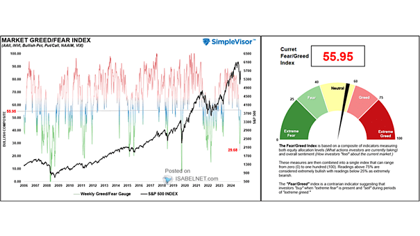
Wage Growth, Monetary Policy and S&P 500

Wage Growth, Monetary Policy and S&P 500 When the spread between wage growth and the Fed funds rate is wide, it is generally positive for equities. Image: Topdown Charts

U.S. 10-Year/2-Year Yield Curve and Recession

U.S. 10-Year/2-Year Yield Curve and Recession After the first Fed rate cut, a steepening of the U.S. 2-Year/10-Year spread could suggest a recession is coming. Image: UBS

S&P 500 Quarterly Operating Earnings Expectations

S&P 500 Quarterly Operating Earnings Expectations Despite the earnings squeeze, the Fed’s dovish pivot and low interest rates should continue to support the stock market. Image: Bianco Research

S&P 500 Returns After Rate Cuts Near Highs

S&P 500 Returns After Rate Cuts Near Highs Since 1980, the Fed has cut rates 17 times (S&P 500 within 2% of new highs). One year later, the S&P 500 was still higher. Image: Ryan Detrick, LPL Financial LLC

U.S. Yield Curve vs. Recessions

U.S. Yield Curve vs. Recessions The chart shows the 10-year Treasury yield minus Fed funds rate yield curve and recessions. Historically, a flat or inverted yield curve is associated with slow economic growth or recessions. The longer the yield curve stays inverted, the better it predicts recession. A Fed rate cut similar to 1995 could…

Total Outlays (Spending) to GDP

Total Outlays (Spending) to GDP This chart shows the percentage share of GDP that the U.S. federal government spends. Image: Bianco Research

U.S. Total Receipts (Taxes) to GDP

U.S. Total Receipts (Taxes) to GDP This chart shows the percentage share of GDP that is collected by the U.S. federal government through taxes. Image: Bianco Research