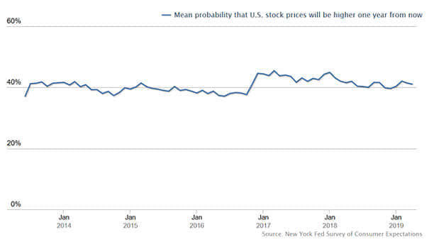
S&P 500 Returns After Rate Cuts Near Highs

S&P 500 Returns After Rate Cuts Near Highs Since 1980, the Fed has cut rates 17 times (S&P 500 within 2% of new highs). One year later, the S&P 500 was still higher. Image: Ryan Detrick, LPL Financial LLC

U.S. Yield Curve vs. Recessions

U.S. Yield Curve vs. Recessions The chart shows the 10-year Treasury yield minus Fed funds rate yield curve and recessions. Historically, a flat or inverted yield curve is associated with slow economic growth or recessions. The longer the yield curve stays inverted, the better it predicts recession. A Fed rate cut similar to 1995 could…

Total Outlays (Spending) to GDP

Total Outlays (Spending) to GDP This chart shows the percentage share of GDP that the U.S. federal government spends. Image: Bianco Research

U.S. Total Receipts (Taxes) to GDP

U.S. Total Receipts (Taxes) to GDP This chart shows the percentage share of GDP that is collected by the U.S. federal government through taxes. Image: Bianco Research

Detecting and Measuring Asset Bubbles

Detecting and Measuring Asset Bubbles Detecting and measuring asset bubbles is not always an easy task. This chart puts into perspective the current U.S. households financial assets to GDP and the U.S. federal debt as percentage of GDP.

The Yield Curve Leads VIX (Volatility) by Three Years

The Yield Curve Leads VIX (Volatility) by Three Years Is more volatility expected ahead? This chart suggests that the CBOE Volatility Index or VIX usually follows the U.S. 10-year vs. 3-month Treasury spread (inverted) with a 3-year lag. You may also like “VIX is in a Transitory State” and “Fed Funds Target Rate and VIX.”…

S&P 500 Index vs. Global M1 Liquidity

S&P 500 Index vs. Global M1 Liquidity Another good correlation between the S&P 500 Index and global M1 liquidity, while the Fed plans to stop quantitative tightening. The money supply M1 is the amount of effective money in the economy. Image: Nordea and Macrobond

S&P 500 and Recession Probability

S&P 500 and Recession Probability Great chart showing twelve Fed easing cycles since the 1950s, including the recession probability and the average return of the S&P 500 Index. Image: Fidelity Investments

U.S. Recessions since 1957

U.S. Recessions since 1957 This chart shows that almost every Fed rate cut has been associated with a recession. Image: John P. Hussman