The Drawdowns of 2018-2019
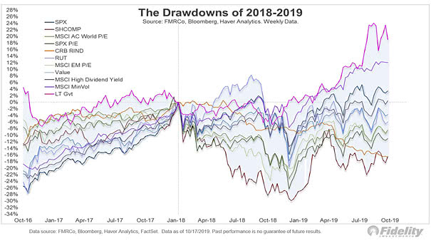
The Drawdowns of 2018-2019 This nice chart shows another good way to measure drawdowns, by looking at valuations and measuring time. Image: Fidelity Investments
The Drawdowns of 2018-2019 This nice chart shows another good way to measure drawdowns, by looking at valuations and measuring time. Image: Fidelity Investments
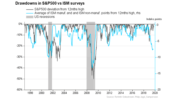
Drawdowns in S&P 500 vs. ISM Surveys Interesting chart showing drawdowns in S&P 500 versus ISM surveys. Weakness in the manufacturing and service sectors matters. Image: Sampension

S&P 500 Drawdowns Drawdowns don’t have a precise time to start or end and they happen all the time. This chart puts into perspective S&P 500 drawdowns. Image: Bianco Research
S&P 500 Maximum Intra-Year Drawdown Since 1950, the average maximum drawdown for the S&P 500 is -13.5% and the median is -10.6%. You may also like “S&P 500 Index Drawdowns From 2 Year Highs.” Image: LPL Research
Maximum Intra-Year Drawdown for the S&P 500 Since 1950, the median maximum drawdown for the S&P 500 is -10.6% and the average is -13.5%. You may also like “S&P 500 Index Drawdowns From 2 Year Highs.” Image: Of Dollars And Data
Maximum Drawdown vs. Annual S&P 500 Returns The annual return of the S&P 500 can be positive, even after a large drawdown. Image: Of Dollars And Data
The S&P 500’s Drawdown and The Target Fed Funds Rate Fed rate cuts have generally been associated with recessions and drawdowns. Image: Bianco Research
S&P 500 Index and Trend Line Support A drawdown to the long-term trendline from the 2009 lows would be painful for U.S. equity investors. Image: Real Investment Advice
S&P 500 Equity Risk Premium (Using Breakevens) The S&P 500 equity risk premium remains much lower than it was in March 2020. Is a drawdown on the horizon? Image: Morgan Stanley Research
Bear Market – Comparing Speed of Decline to Speed of Recovery Of the 10 stock market drawdowns of about 30% since 1920, the median time needed to recover half of losses, was half the duration of the decline. Image: CNBC
S&P 500 – 1987 vs. 2008 vs. 2020 This chart shows the percentage of stocks below their 50-day moving average vs. the 1987 & 2008 drawdowns. Image: Fidelity Investments