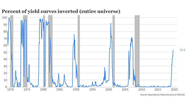
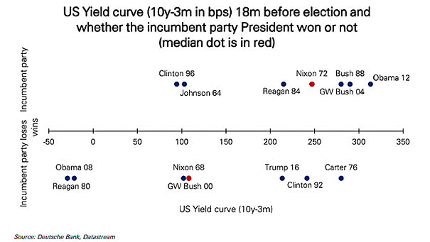
Wage Growth, Monetary Policy and S&P 500
Wage Growth, Monetary Policy and S&P 500 When the spread between wage growth and the Fed funds rate is wide, it is generally positive for equities. Image: Topdown Charts
Tariffs Are Raising Prices for U.S. Consumers The charts show that U.S. consumer and producer prices have risen more quickly in tariff-affected categories. This is unfortunate in this late business cycle. Image: Goldman Sachs Global Research
Survey: What Is The Most Effective Risk-Off Hedge? In the latest BofA Merrill Lynch edition of the FX and rates sentiment survey, a majority of respondents preferred 10-year Treasuries as the most effective risk-off hedge. Only 6% of respondents chose gold and the yen. Image: BofA Merrill Lynch
Contribution of Consumption to China’s GDP Growth This chart shows that consumption is the primary driver of China’s economic growth. You may also like “China Real GDP Growth Projection.” Image: ANZ Research
U.S. Budget Deficits and the U.S. Dollar Pretty good correlation between U.S. budget deficits and the U.S. dollar over the past 30 years. The chart suggests that the U.S. dollar should weaken over time. You may also like “U.S. Twin Deficits (% of GDP) Lead Real Trade Weighted Dollar Index by Two Years” and “U.S. Dollar…
U.S. Initial Unemployment Claims and U.S. GDP There is a pretty good correlation between U.S. initial unemployment claims and U.S. GDP. Initial unemployment claims could suggest an acceleration of U.S. GDP in Q3 2019. Click on the Image to Enlarge
The Trade War Effect on Crude Oil This chart shows Chinese imports of crude oil from U.S.. Image: Capital Economics
Leading Economic Indicators (LEI): U.S. vs. Global Leading economic indicators appear to be stabilizing, outside the United States. The central banks’ policy response could have a positive knock-on effect on global growth. Image: Legg Mason
Heat Map of Key Recession Indicators Higher probability of recession than average in red, and lower probability of recession than average in green. Image: BofA Merrill Lynch Global Research
World – Gross Government Debt as Percentage of GDP A look at gross government debt in 2019. Image: IMF
World Semiconductor Sales Lead Emerging Markets This chart suggests that world semiconductor sales lead the MSCI emerging markets index by 3 months. This is very interesting before investing in emerging market equities. Country weights of the MSCI Emerging Markets Index: 33% China, 13.02% Korea, 11.35% Taiwan. Image: Nordea and Macrobond