U.S. Yield Curve Leads Corporate Profits
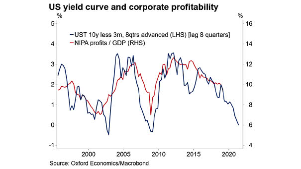
U.S. Yield Curve Leads Corporate Profits This chart suggests that the U.S. 10-year less 3-month yield curve leads corporate profits by two years. Image: Oxford Economics, Macrobond
U.S. Yield Curve Leads Corporate Profits This chart suggests that the U.S. 10-year less 3-month yield curve leads corporate profits by two years. Image: Oxford Economics, Macrobond
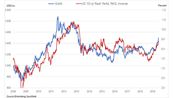
Gold vs. U.S. 10-Year Real Yield The chart shows the nice correlation between the U.S. 10-year real yield (inverted) and the price of gold as a defensive asset Image: Saxo Bank
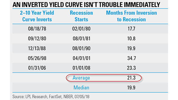
Inverted Yield Curve: Months From Inversion to Recession Historically, the time lag between the inversion and the recession was 21 months Image: LPL Research
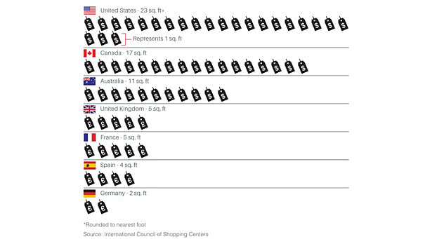
Amount of Retail Space per Person in the U.S. vs. Other Developed Nations America’s retail apocalypse has only just begun. Image: International Council of Shopping Centers
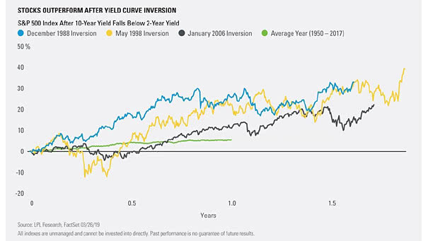
S&P 500 Index After U.S. Treasury 2-10 Year Yield Curve Inversion The chart shows that stocks outperform after yield curve inversion (green line: average year from 1950 to 2017). Image: LPL Research
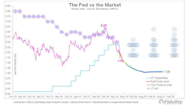
The Fed vs. the 10-Year Treasury Yield The Fed fund curve suggests that the 10-year Treasury yield could fall below its all-time low of 1.32% in 2016. Image: Fidelity Investments
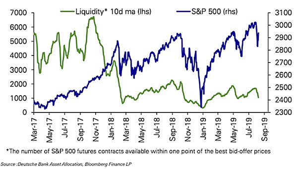
Liquidity in U.S. Equity Futures Liquidity in U.S. equity futures collapsed in early 2018. It has remained at very low levels. The lack of liquidity could lead to violent market moves. Image: Deutsche Bank
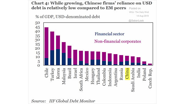
China: Chinese Firms Reliance on USD-denominated Debt Chinese firms reliance on USD-denominated debt is lower than other emerging markets. But a weakened yuan would hurt Chinese firms. Image: Institute of International Finance
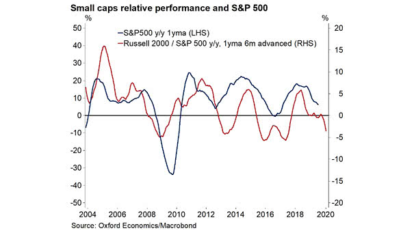
Small Caps Relative Performance Leads the S&P 500 Index This chart suggests that small caps relative performance leads the S&P 500 Index by six months. Image: Oxford Economics, Macrobond
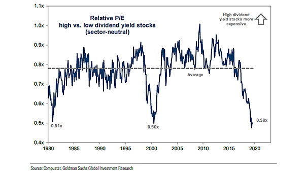
Valuation Gap Between High and Low Dividend Yield Stocks This chart shows that the valuation gap between high and low dividend yield stocks is almost the widest ever. Image: Goldman Sachs Global Investment Research
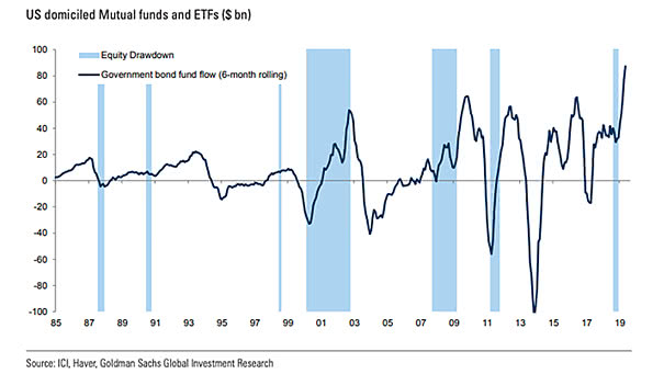
U.S. Government Bond Fund Flows Over the last six months, U.S. government bond fund flows have been the largest since 1985. Image: Goldman Sachs Global Investment Research