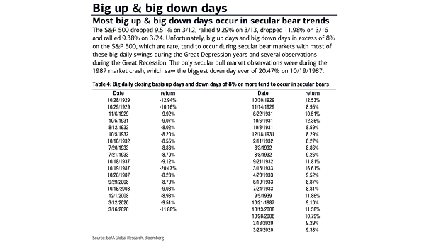
Secular Bear Market – Big Up & Big Down Days
Secular Bear Market – Big Up & Big Down Days Most big up & big down days tend to occur during secular bear markets. Image: BofA Global Research
Secular Bear Market – Big Up & Big Down Days Most big up & big down days tend to occur during secular bear markets. Image: BofA Global Research
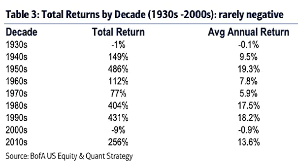
Total Returns by Decade History suggests that over a 10-year time horizon, returns are rarely negative. Image: BofA US Equity & Quant Strategy
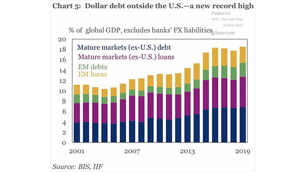
U.S. Dollar Debt Outside The United States The amount of U.S. dollar-denominated debt outside the United States has hit a new record high Image: Institute of International Finance
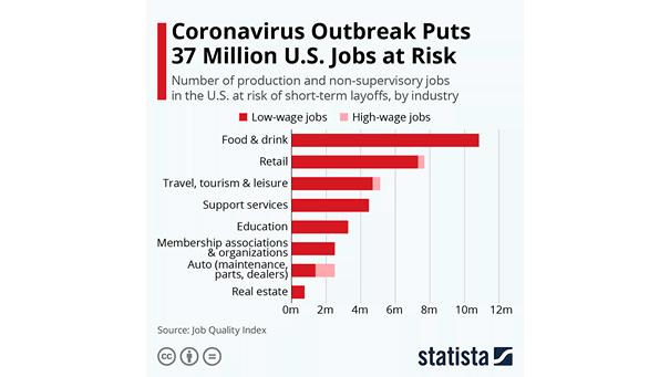
U.S. Jobs at Risk of Short-Term Layoffs Coronavirus outbreak and complete lockdowns put 37 million jobs at risk in the United States. Image: Statista

S&P 500 and U.S. Coronavirus Cases This chart shows the correlation between the S&P 500 and U.S. coronavirus cases (for informational purpose only). Image: Nautilus Research
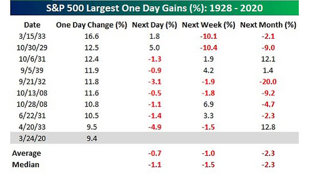
S&P 500 Largest One Day Gains 1928 – 2020 The largest daily gains in the S&P 500 tend to occur during secular bear markets. Image: Bespoke Investment Group
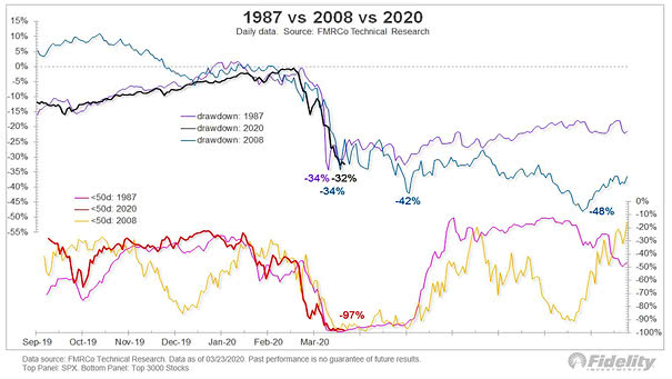
S&P 500 – 1987 vs. 2008 vs. 2020 This chart shows the percentage of stocks below their 50-day moving average vs. the 1987 & 2008 drawdowns. Image: Fidelity Investments
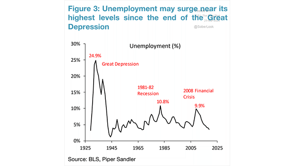
U.S. Unemployment Rate Expected in 2020 Dr. James Bullard, President of the Federal Reserve Bank of St. Louis, said that the U.S. unemployment rate may hit 30% in Q2 2020. Image: Piper Sandler
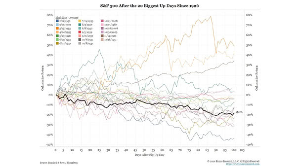
S&P 500 After the 20 Biggest Up Days Since 1926 Since 1926, after the 20 biggest up days, 70% are lower 100 days later and the decline going forward is -18.1% on average. Image: Bianco…
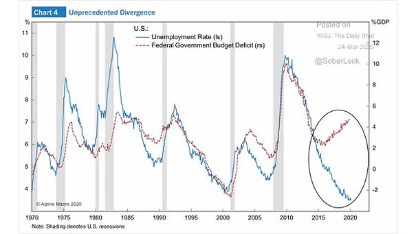
U.S. Unemployment Rate and U.S. Federal Government Budget Deficit This chart shows the unprecedented divergence between the U.S. unemployment rate and the U.S. federal government budget deficit. Image: Alpine Macro
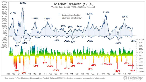
Market Breadth (S&P 500) New 52-week highs minus new 52-week lows is the third lowest in history after 2008 and the 1930s. Image: Fidelity Investments