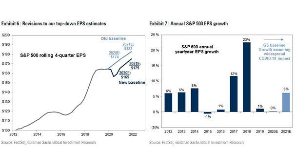
Annual S&P 500 EPS Growth
Annual S&P 500 EPS Growth Goldman Sachs expects no earnings growth this year. Image: Goldman Sachs Global Investment Research
Annual S&P 500 EPS Growth Goldman Sachs expects no earnings growth this year. Image: Goldman Sachs Global Investment Research
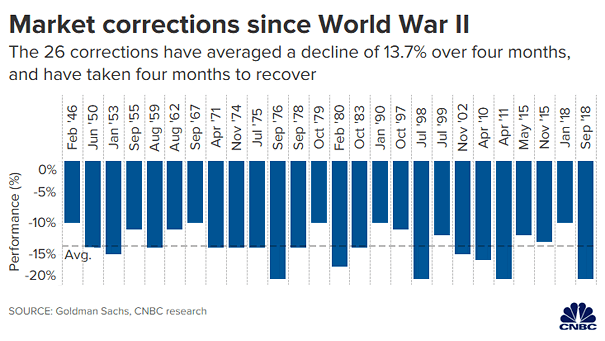
U.S. Market Corrections since World War II Since World War II, the 26 corrections have an average decline of 13.7% over four months, and have taken four months to recover. Image: CNBC
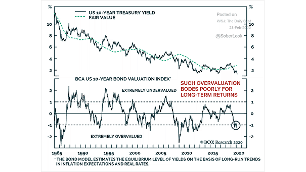
Valuation – U.S. 10-Year Treasury Yield vs. Fair Value Chart suggesting that U.S. 10-year Treasuries are extremely overvalued. Image: BCA Research
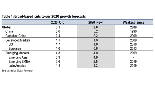
2020 Global GDP Growth Forecasts BofA cuts global growth to 2.8% in 2020. Image: BofA Global Research
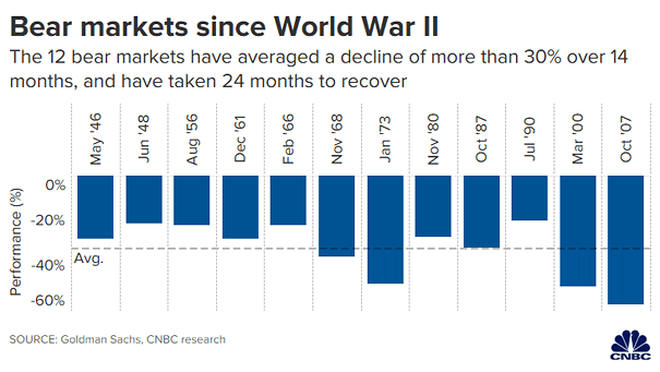
U.S. Bear Markets since World War II Since World War II, the 12 bear markets have an average decline of 32.5% over 14.5 months, and have taken 24 months to recover on average. Image: CNBC
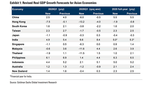
Revised Real GDP Growth Forecasts for Asian Economies Goldman Sachs slashed growth forecasts for Asian economies, as the coronavirus impacts economic activity. Image: Goldman Sachs Global Investment Research

S&P 500 Drawdowns – Average Corrections since WW2 The recent correction has been sharper than the average since WW2, with the S&P 500 going to correction territory in a few days. Image: Goldman Sachs Global…
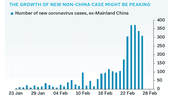
Number of New Coronavirus Cases, Ex-Mainland China Chart suggesting that the growth of new coronavirus cases, ex-Mainland China, might be peaking. Image: Pantheon Macro
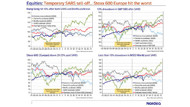
Coronavirus – Equity Market Moves and Past Virus Outbreaks The chart shows past virus outbreaks, highlighting the S&P 500, Stoxx 600, Hang Seng and MSCI World. Image: Nordea and Macrobond
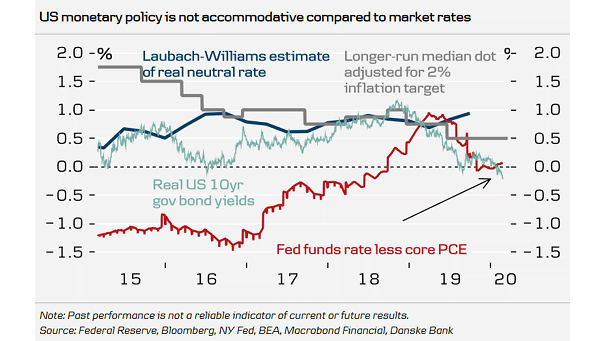
Fed Funds Rate Less Core PCE and Real U.S. 10-Year Government Bond Yields Chart suggesting that monetary policy is becoming too tight. Image: Danske Research
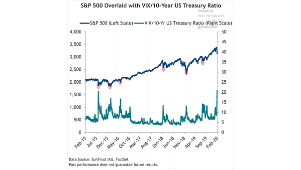
S&P 500 and VIX/10-Year U.S. Treasury Ratio Chart showing how spikes in the VIX/10-Year U.S. Treasury ratio result in lower equity prices. Image: Truist