Brexit: What the European Union Loses?
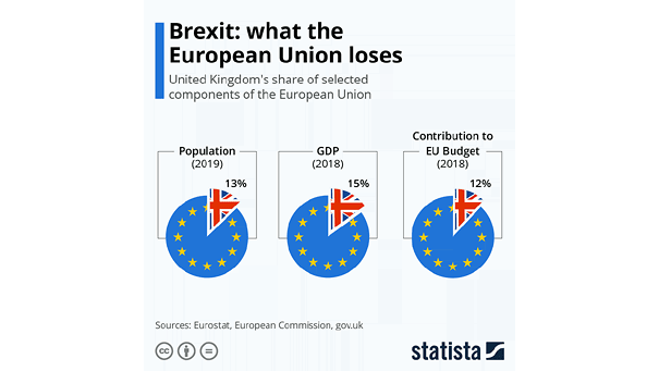
Brexit: What the European Union Loses? The chart puts into perspective what the European Union stands to lose when the Brexit transition is complete. Image: Statista
Brexit: What the European Union Loses? The chart puts into perspective what the European Union stands to lose when the Brexit transition is complete. Image: Statista
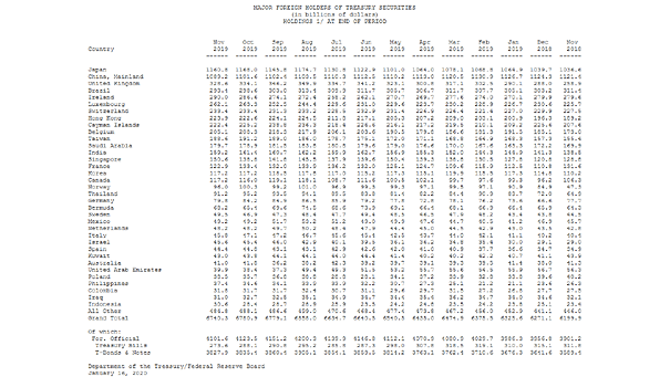
Treasury Holdings: Who Are the Major Foreign Holders of U.S. Treasury Securities? Currently, the two major foreign holders of U.S. Treasury securities are Japan and China. Japan surpasses China as largest foreign holder of U.S. Treasuries.…
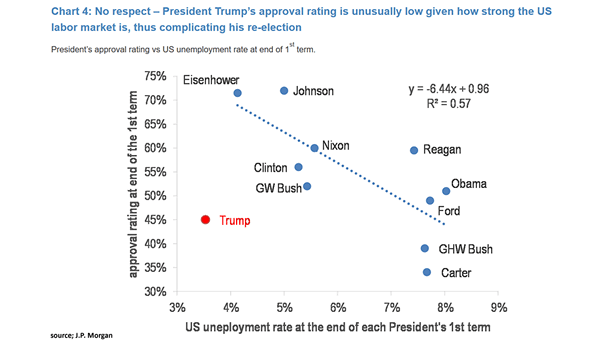
U.S. President’s Approval Rating vs. U.S. Unemployment Rate at End of First Term President Trump’s approval rating is historically low compared to the unemployment rate. Image: J.P. Morgan
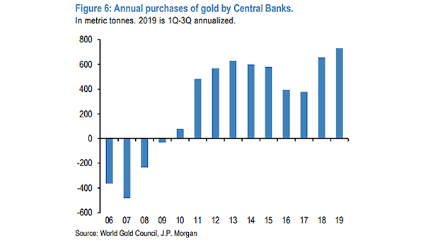
Annual Purchases of Gold by Central Banks The first three quarters of 2019 were the largest central banks purchase of gold in recent history, due to geopolitical tensions. Image: J.P. Morgan
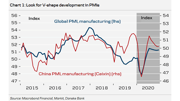
Global Manufacturing PMI and China Manufacturing PMI The chart suggests a sharp rebound of PMI in Q2 2020 on back of coronavirus. Image: Danske Research
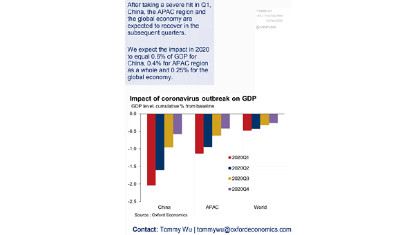
Impact of Coronavirus Outbreak on GDP The impact of the coronavirus outbreak on global GDP is estimated at 0.25% in 2020. Image: Oxford Economics
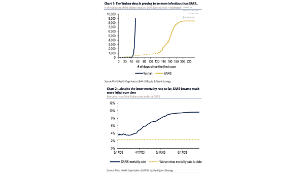
Coronavirus vs. SARS These two charts suggest that the coronavirus is less deadly but more infectious than SARS Image: BofA US Equity & Quant Strategy
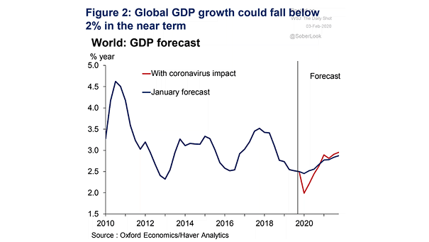
Global GDP Forecast This chart suggests the impact of the coronavirus outbreak on global GDP. Image : Oxford Economics
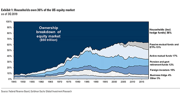
Ownership Breakdown of the U.S. Equity Market Chart showing who owns the U.S. equity market. Image: Goldman Sachs Global Investment Research
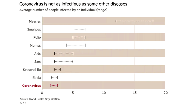
Coronavirus Is Not As Infectious As Some Other Diseases This chart shows how contagious the coronavirus is. Image: Financial Times