Central Bank Outlook
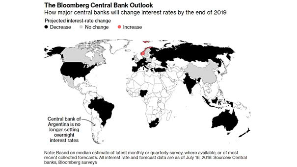
Central Bank Outlook Interesting chart showing how major central banks will change interest rates by the end of this year (projected interest-rate change). Picture Source: Bloomberg
Central Bank Outlook Interesting chart showing how major central banks will change interest rates by the end of this year (projected interest-rate change). Picture Source: Bloomberg
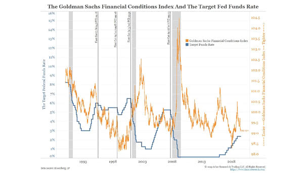
The GS Financial Conditions Index and The Target Fed Funds Rate The Goldman Sachs Financial Conditions Index is not at its lowest level and the current levels are quite similar than previous first rate cuts.…
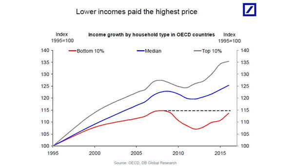
Lower Incomes Paid the Highest Price Low-income groups are slowly recovering after the financial crisis. Inequality: you may also like “U.S. Net Worth by Wealth Bracket.” Image: Deutsche Bank Global Research
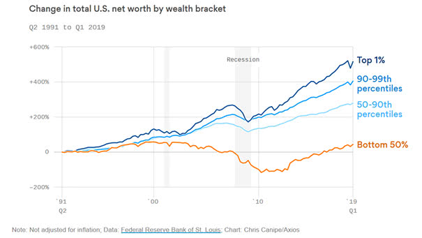
U.S. Net Worth by Wealth Bracket Another chart showing the wealth disparities before and after the Great Recession. Inequality: you may also like “Lower Incomes Paid the Highest Price.” Image: Axios
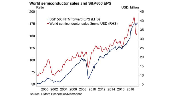
World Semiconductor Sales and S&P 500 EPS Tight relationship between world semiconductor sales and S&P 500 earnings per share. You may also like “Semiconductor Sales vs. Global Earnings per Share.” Image: Oxford Economics
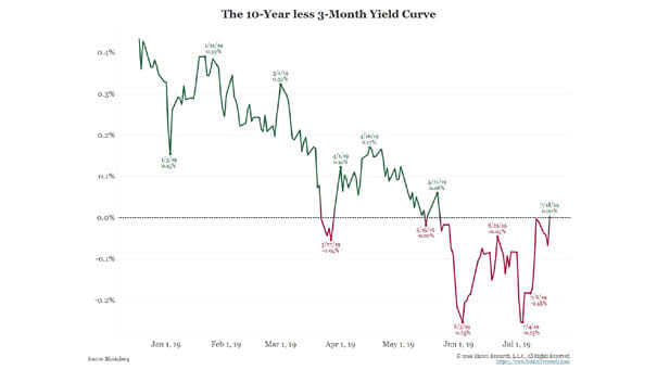
The 10-Year minus 3-Month Yield Curve With the 3-month Treasury yield falling, the 10-year minus 3-month yield-curve spread is steepening. Keep in mind that a positive spread facilitates borrowing short and lending long. Image: Bianco Research
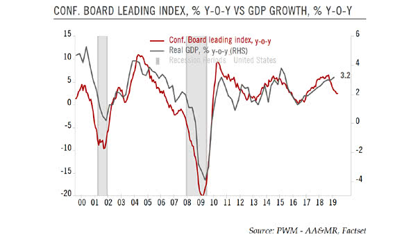
Conference Board U.S. Leading Index vs. U.S. GDP Growth This chart shows the strong correlation between the Conference Board U.S. Leading Index Year-over-Year and U.S. GDP growth. The U.S. LEI suggests a weakness in U.S. GDP…
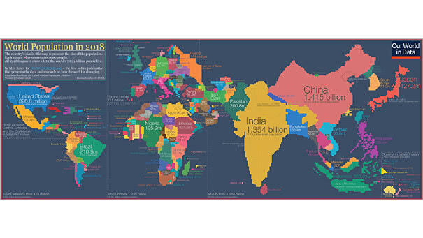
World Population in 2018 Interesting world map: the country’s size represents the size of the population. You may also like “World Population & Demographics – More People Over 65 than Under 5 for the First…
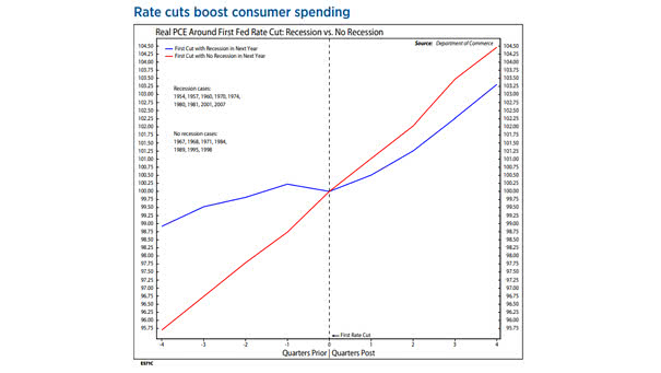
Fed Rate Cuts Boost Consumer Spending The chart shows real PCE around first Fed rate cut: recession vs. no recession. Fed rate cuts are more effective during a recession. Image: Ned Davis Research
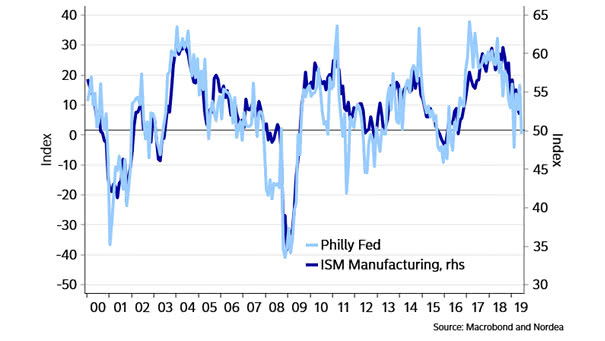
ISM Manufacturing Index vs. Philly Fed Today, the Philadelphia Federal Reserve Manufacturing Index at 21.8 suggests that the ISM Manufacturing Index should remain above 50. Image: Nordea and Macrobond
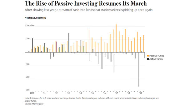
The Rise of Passive Investing Net inflows into index-tracking U.S. mutual funds and ETFs rose by around 50% in the second quarter from a year earlier. Image: The Wall Street Journal