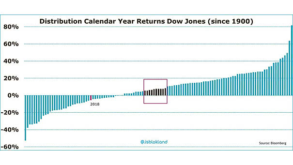
Value of U.S. Corporate Bonds by Rating
Value of U.S. Corporate Bonds by Rating Since the Great Recession, the U.S. corporate bond debt rated ‘BBB’ exceeds $3 trillion. If the U.S. economy goes wrong, this is bad news for investors. Image: The…
Global Yield Curves Global flattening yield curves sound the alarm about the economic outlook. Image: Capital Economics
S&P 500 Cash Return Yield by Sector and Region Currently, the S&P 500 cash return yield (buybacks + dividends) is 5.2%, the highest since 2011. That’s much more than Europe, Japan and emerging markets. Image:…
Foreign Holders of U.S. Debt Currently, China and Japan hold the most U.S. debt. Image: howmuch.net
S&P 500 Low Volatility Stocks Are the Best Performing Asset YTD This chart shows that S&P 500 low volatility stocks are the best performing asset year-to-date (outside of GSCI energy). Actually, high-quality stocks are a good…
History of the Real Federal Minimum Wage Today, the real federal minimum wage is worth 31% less than in 1968. It is also the longest period without an increase (adjusted for inflation). You may also…
U.S. Monthly Average 30-Year Fixed Mortgage Rates Keep in mind that mortgage costs are influenced by the 10-year Treasury yield. 30-year mortgage rates = 1.739 x (10-year treasury yield)² + 0.7755 x (10-year treasury yield)…
Labor Costs Lead Core Inflation by 6 Months Historically, U.S. labor costs have been a good leading indicator of core inflation, because when labor costs rise, companies tend to increase their prices. Image: Legg Mason
Demographics Explain Sovereign 30-Year Yields Accross Emerging Markets Another great chart showing that emerging market demographics explain 30-year sovereign bond yields. An R² of 0.80 is quite high and significant. You may also like “U.S.…
“Yield Curve” Google Trends vs. 10Y-3M Yield Spread This interesting chart shows the Google trends interest for the “yield curve” compared to the U.S. 10-year minus 3-month Treasury yield spread. If history helps us predict…
What Happens When the S&P 500 is Up 15% at Mid-Year? History tells us that the rest of the year is generally quite good. Image: LPL Research