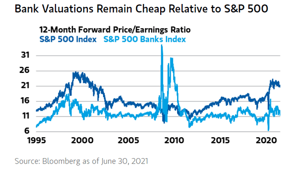
S&P 500 Average Across Market Cycles Since 1973
S&P 500 Average Across Market Cycles Since 1973 This chart puts into perspective the typical phases of the U.S. equity market since 1973. Image: Goldman Sachs Global Investment Research
MSCI World vs. U.S. 10-Year Bond Performance Around Bear Markets After the shortest, and one of the sharpest bear markets in history, the equity vs. bond performance is now better than post-GFC. Image: Goldman Sachs Global Investment Research
MSCI World Value vs. Growth Around Bear Markets So far, the performance of value vs. growth remains worse than post-GFC. Image: Goldman Sachs Global Investment Research
S&P 500 Earnings Yield and U.S. 10-Year Treasury Yield Higher U.S. 10-year Treasury yields would weigh on U.S. equities. Image: Richardson Wealth
Real Yield – Five-Year Government Bonds, U.S. and Germany Real rate convergence helps explain the weakness of the U.S. dollar. Image: Morgan Stanley Wealth Management
Valuation – Real Forward Earnings Yield vs. S&P 500 Index Is inflation transitory? The S&P 500 looks expensive with real earnings yields at record lows. Image: Lohman Econometrics
U.S. 10-Year Treasury Yield and Taper Announcement Historically, QE tapering tends to push U.S. 10-year Treasury yields lower. Image: Charles Schwab
European Stocks and MSCI U.S. – Cyclically Adjusted Price-Earnings Ratio (CAPE) Why are U.S. equities more expensive than European stocks? Image: Financial Times
U.S. Federal Reserve – Assets and Fed Funds Could the Federal Reserve raise interest rates later than expected? Image: BCA Research
U.S. House Prices and Inflation Since 1991, U.S. house prices have protected Americans well from inflation. Image: Deutsche Bank
U.S. Population Growth by State Long-term population decline can lead to economic stagnation and disaster. Image: Quill Intelligence, LLC