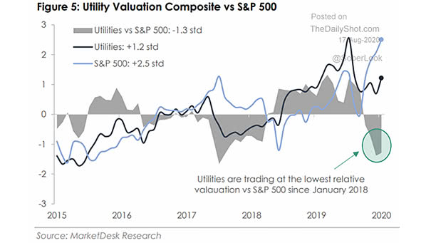
Utility Valuation Composite vs. S&P 500
Utility Valuation Composite vs. S&P 500 Could utilities outperform the S&P 500? Image: MarketDesk Research
Utility Valuation Composite vs. S&P 500 Could utilities outperform the S&P 500? Image: MarketDesk Research
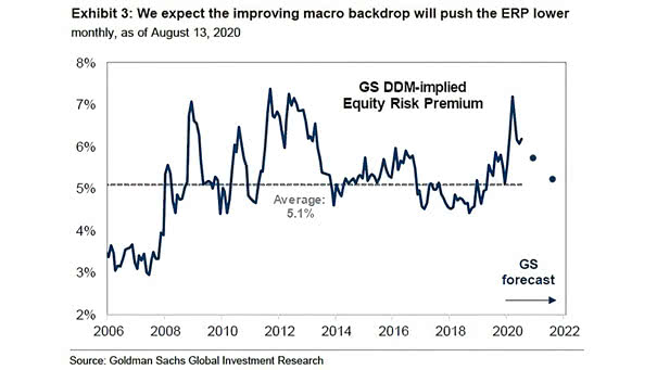
Dividend Discount Model (DDM) Implied Equity Risk Premium (ERP) Goldman Sachs expects the equity risk premium to be lower moving forward, as the macro backdrop strengthens. Image: Goldman Sachs Global Investment Research
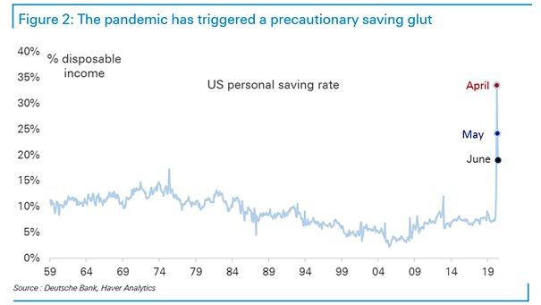
U.S. Personal Saving Rate Since 1959 Precautionary saving could weigh down on consumption. Image: Deutsche Bank
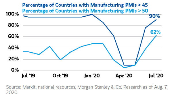
Percentage of Countries with Manufacturing PMIs Above 50 and 45 Manufacturing PMIs suggest that the worst is over in most countries. Image: Morgan Stanley Wealth Management
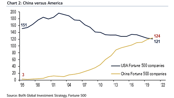
China vs. USA The number of Chinese companies in the Fortune Global 500 now exceeds that of the United States. Image: BofA Global Investment Strategy
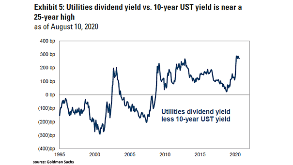
Utilities Dividend Yield Less 10-Year U.S. Treasury Yield Goldman Sachs upgraded utilities to outperform, as the utilities dividend yield is relatively high compared to the 10-year U.S. Treasury yield. Image: Goldman Sachs Global Investment Research
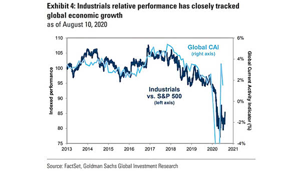
Performance – Industrials vs. S&P 500 and Global Current Activity Indicator (CAI) Goldman Sachs upgraded industrials to outperform, as global economic growth is improving. Image: Goldman Sachs Global Investment Research
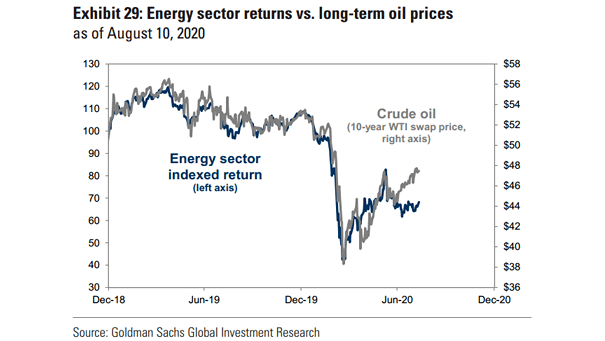
Valuation – Energy Sector Returns vs. Long-Term Oil Prices Is the energy sector a relative bargain? Is the energy sector a relative bargain? Goldman Sachs is still “underweight” energy stocks. Image: Goldman Sachs Global Investment Research
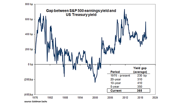
Gap Between S&P 500 Earnings Yield and U.S. Treasury Yield This chart suggests that the S&P 500 looks attractive relative to bonds, as the spread between the S&P 500 earnings yield and the U.S. 10-year Treasury yield is 368bps. Image: Goldman Sachs Global Investment Research
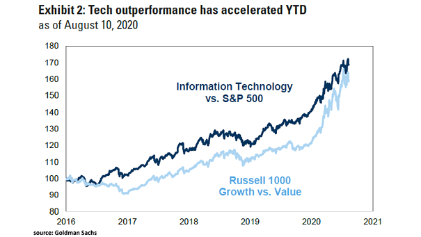
Performance – Information Technology vs. S&P 500 and Russell 1000 Growth vs. Value Trees don’t grow to the sky, but so far, tech is the darling of the market. Image: Goldman Sachs Global Investment Research
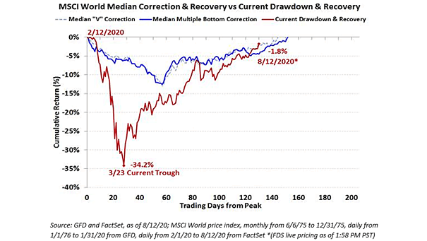
MSCI World Median Correction and Recovery vs. Current Drawdown This charts shows a “beautiful V” and puts the current drawdown into perspective. Image: Ken Fisher, Fisher Investments