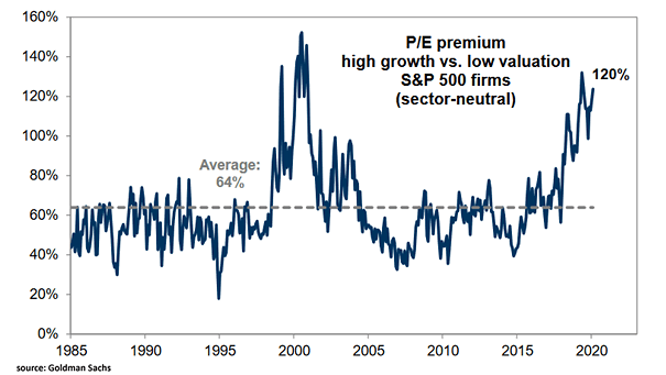
Global Investment Research Financial Excess Monitor and Recessions
Global Investment Research Financial Excess Monitor and Recessions The heat map suggests below-average imbalances in the U.S. economy. Image: Goldman Sachs Global Investment Research
Bond Fund Flows Bond funds hit inflow record, reflecting investor fears about the coronavirus’s spread. Image: BofA Global Investment Strategy
U.S. Dollar and President Trump This chart shows the correlation between the U.S. dollar and President Trump’s approval ratings Image: TD securities
Odds of Various S&P 500 One-Year Total Returns During U.S. Economic Expansions This chart suggests the probability of positive one-year market returns when the U.S. economy is expanding. Image: Investment Strategy Group, Bloomberg
S&P 500 Next Twelve Months P/E vs. Dollar Index This chart suggests that the strength of the U.S. dollar supports higher P/E multiples for the S&P 500. Image: Strategas
S&P 500 – Secular Bull Market Analogs The bull market that began in 2009 could have similarities with the secular bull markets of 1982-2000 and 1949-1968. Since the Great Recession, US stocks have behaved like a secular bull market. Image: Fidelity Investments
U.S. Wage Growth and U.S. Unemployment Rate Has U.S. wage growth peaked? This chart suggests that the U.S. unemployment rate could bottom out at around 3.5% this year. Image: Oxford Economics
Seasonality of U.S. Equity Market Sentiment Index This chart puts into perspective the seasonal pattern in U.S. equity sentiment. Image: Nomura
Relative P/E of Value Stocks vs. S&P 500 vs. U.S. Manufacturing PMI Index BofA remains bullish on value stocks in the coming months, due to improving macro conditions. Image: BofA U.S. Equity and Quant Strategy
Gold Prices vs. Commodities The declining correlation between the price of gold and commodities may suggest that the commodity bear super-cycle is nearing its end. Image: Wells Fargo Investment Institute
U.S. Market Breadth At the dotcom bubble peak, the percentage of stocks outperforming the S&P 500 was 27% vs. 42% today (the historical average is 48%). Currently, the relative market breadth isn’t as extreme as it was in 2000. Image: Fidelity Investments