Does Quantitative Easing Affect Valuation?
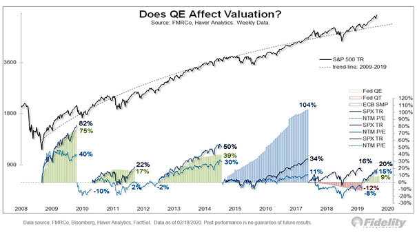
Does Quantitative Easing Affect Valuation? More fundamentally, low interest rates, high margins, low taxes, buybacks & free cash flow drive stocks higher. Image: Fidelity Investments
Does Quantitative Easing Affect Valuation? More fundamentally, low interest rates, high margins, low taxes, buybacks & free cash flow drive stocks higher. Image: Fidelity Investments
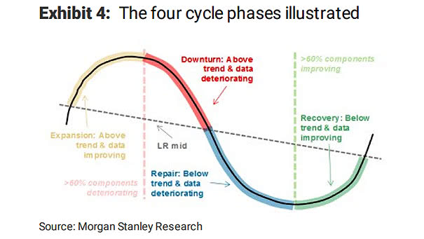
The Four Business Cycle Phases This chart explains the four cycle phases; expansion, downturn, repair, and recovery. Image: Morgan Stanley Research
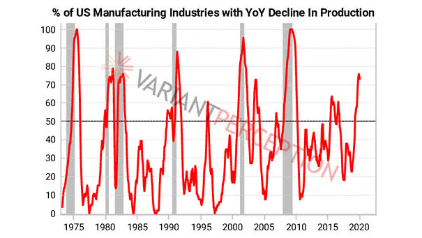
% of U.S. Manufacturing Industries with YoY Decline in Production A recession hasn’t arrived yet in the U.S., with almost 75% of manufacturing industries with year-over-year decline in production. Image: Variant Perception
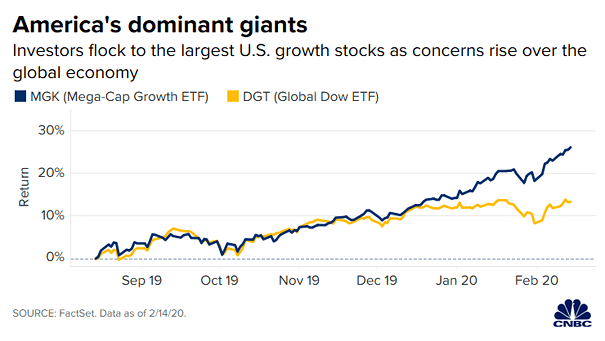
U.S. Growth Stocks – Mega-Cap Growth ETF vs. Global Dow ETF This chart suggests a warning sign of market ‘euphoria’, as the P/E of the Vanguard Mega-Cap Growth ETF is now 30. Image: CNBC
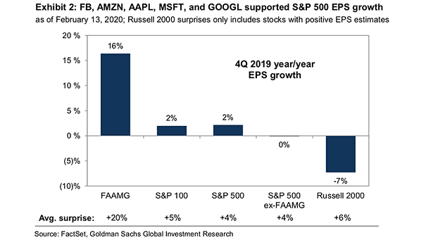
Facebook, Amazon, Apple, Microsoft and Google and S&P 500 EPS Growth FAAMG supported S&P 500 EPS growth. Image: Goldman Sachs Global Investment Research

Majority of Coronavirus Cases are Mild On the “positive” side, over 80% of the coronavirus cases in China are considered mild. Image: Statista
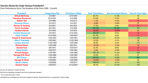
Dow Jones Performance Under Various U.S. Presidents This chart puts into perspective the Dow Jones performance under various U.S. presidents. The annualized return under President Trump is high, given tightening monetary policy. Image: Ryan Detrick, LPL Financial LLC
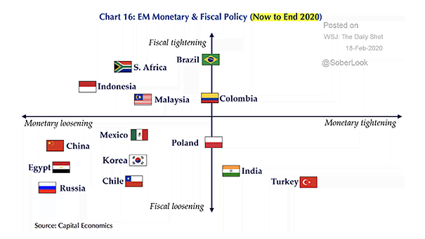
Emerging Markets Monetary and Fiscal Policy This chart puts monetary and fiscal policy in emerging markets into perspective (now to end 2020). Image: Capital Economics
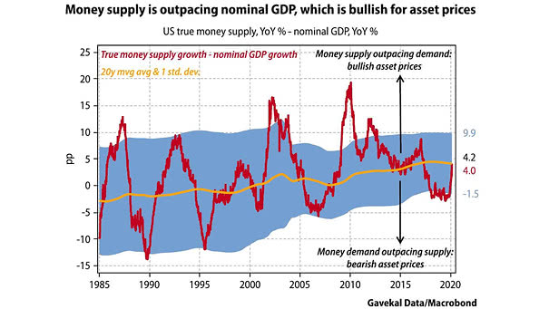
U.S. True Money Supply and Nominal GDP Growth This chart suggests that money supply outpacing U.S. nominal GDP tends to be bullish for asset prices. Image: Gavekal, Macrobond
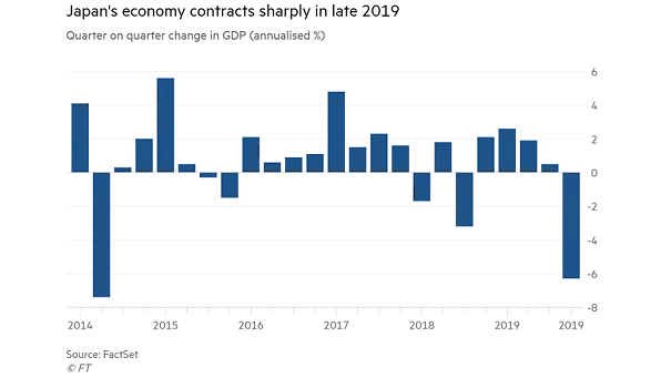
Japan GDP Japan’s economy shrunk at a 6.3% annual rate in late 2019 after sales-tax hike. Image: Financial Times
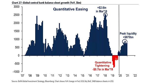
Global Central Bank Balance Sheet Growth and Quantitative Easing BofA suggests that global central bank balance sheets will peak at $879bn in September 2020. Image: BofA Global Investment Strategy