S&P 500 – The 1994-1998-2011 Mini-Bear Analog
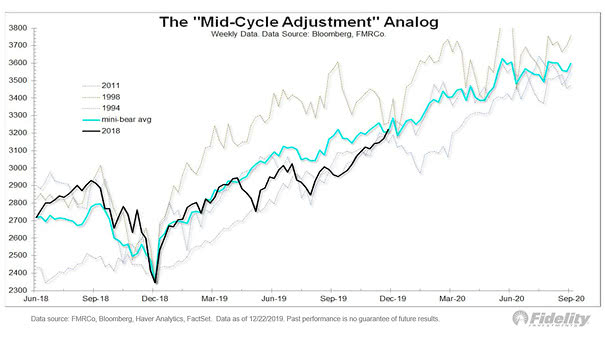
S&P 500 – The 1994-1998-2011 Mini-Bear Analog The “mid-cycle adjustment” analog works very well so far and suggests where the S&P 500 could go next. Image: Fidelity Investments
S&P 500 – The 1994-1998-2011 Mini-Bear Analog The “mid-cycle adjustment” analog works very well so far and suggests where the S&P 500 could go next. Image: Fidelity Investments
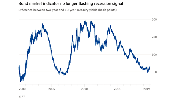
10Y-2Y Yield Curve and U.S. Recession The U.S. yield curve is steepening and suggests optimism for 2020, as investors become more confident in the U.S. economy. Image: Financial Times
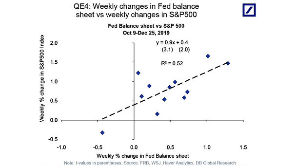
Fed Balance Sheet vs. S&P 500 Chart suggesting that since October 2019, a 1% increase in the Fed balance sheet has been associated with a 0.9% increase in the S&P 500, (R² = 0.52). Image: Deutsche Bank Global Research
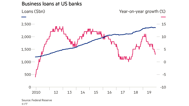
Business Loans at U.S. Banks Business loans at U.S. banks are tightly connected to the real economy and stalled in second half of this year. Image: Financial Times
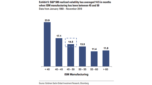
ISM Manufacturing Index and S&P 500 Realized Volatility Interesting chart suggesting the correlation between the S&P 500 realized volatility and the ISM Manufacturing Index. Image: Goldman Sachs Global Investment Research
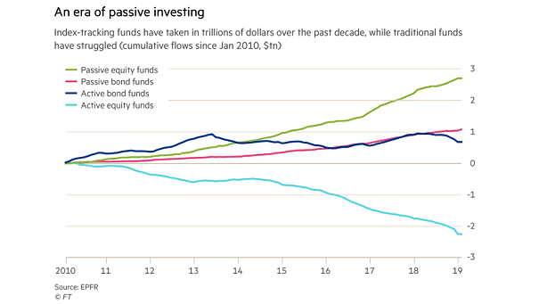
Passive Equity and Bond Funds vs. Active Equity and Bond Funds The popularity of passive investing through ETFs and index mutual funds has grown significantly since 2010. Image: Financial Times
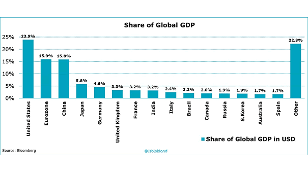
Share of Global GDP Today, U.S. GDP contributes 23.9% of the world’s economic output. In 1960, U.S. GDP was 40% of global GDP. Image: Jeroen Blokland
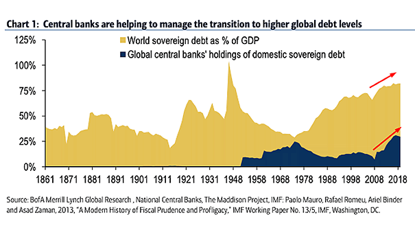
World Sovereign Debt and Global Central Banks’ Holdings of Domestic Sovereign Debt Central Banks now own a high percentage of all global sovereign debt, leading to higher debt levels in coming years. Image: BofA Merrill Lynch Global Research
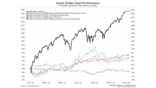
Quant Hedge Fund Performance vs. S&P 500 Does quant trading really work? 2019 was a tough year for quant hedge funds. Image: Bianco Research
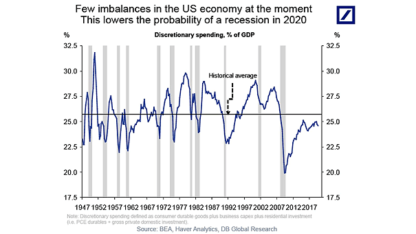
U.S. Discretionary Spending and Recessions Because there are few imbalances, Deutsche Bank suggests that the U.S. expansion could continue for many more years. Note: discreationary spending defined as consumer durable goods, plus business capex, plus residential investment (i.e. PCE durables + gross private domestic investment). Image: Deutsche Bank Global Research
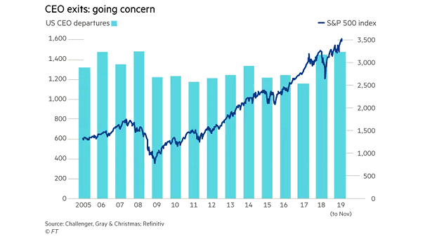
U.S. CEO Departures and S&P 500 Index It is not a good time to be a CEO. This year is on pace to have the most CEO departures on record, at rates not seen since the Great Financial Crisis. Image: Financial Times