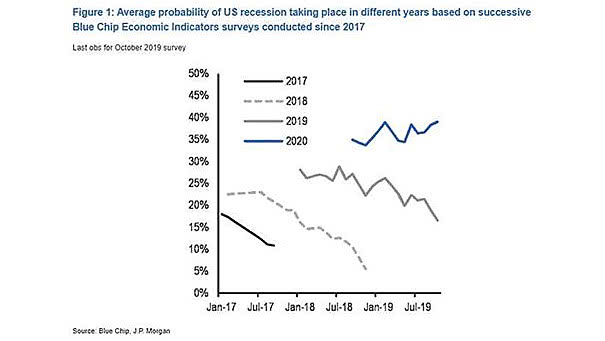
Where Has Job Growth Come from Since 2009?

Where Has Job Growth Come from Since 2009? From a bachelor’s degree (58 millions), some college (37 millions) and high school graduates (36 millions). Actually, this interesting chart shows the importance of education in finding a job. Picture Source: Bianco Research

Growth Over U.S. Presidential Terms

Growth Over U.S. Presidential Terms Since 1960, the U.S. economy has grown faster in the fourth year of the president’s term. Image: ANZ Research

10Y-2Y Yield Curve Inversion vs. S&P 500 Peaks

10Y-2Y Yield Curve Inversion vs. S&P 500 Peaks Chart suggesting that the S&P 500 Index should not peak until June 2020. In recent history, the S&P 500 Index peaks 10 months on average after the 10Y-2Y yield curve inverts. Image: Jeroen Blokland

Inflation, Hard Data and Soft Data

Inflation, Hard Data and Soft Data Hard data are back above long-run averages. But the chart clearly shows the divergence between hard data and soft data. Image: Arbor Research & Trading LLC

China Credit Impulse – Reflation Cycle

China Credit Impulse – Reflation Cycle This chart shows that China credit impulse has not yet boosted relative earnings. Credit impulse is the change in new credit issued as a percentage of GDP. Image: Fidelity Investments

Returns Driven by Central Banks?

Returns Driven by Central Banks? This chart suggests that equity and credit markets are no longer driven by fundamentals, at the moment. Image: Deutsche Bank Global Research