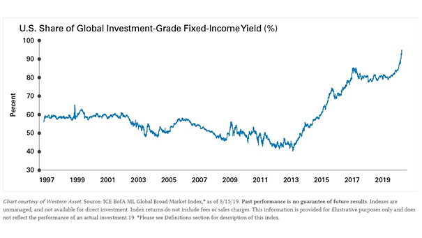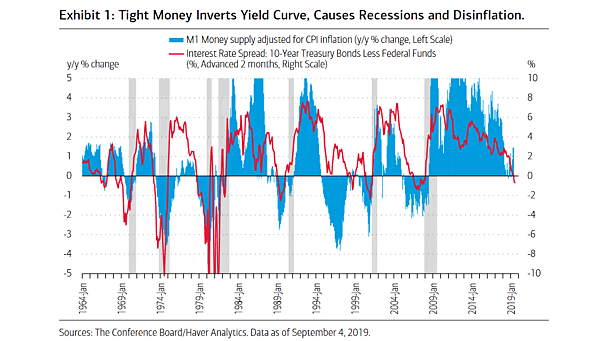
M1 Money Supply vs. Yield Curve and Recessions
M1 Money Supply vs. Yield Curve and Recessions Great chart showing the correlation between M1 money supply and the yield curve. The key factor for inverted yield curves is tight money. Image: BofA Merrill Lynch Global Research