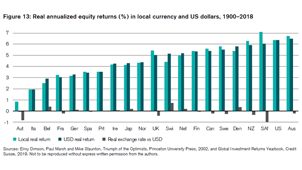
S&P 500 EPS and South Korea Exports
S&P 500 EPS and South Korea Exports Chart showing the quite good correlation between S&P 500 EPS and South Korea exports, and suggesting this does not bode well for S&P 500 EPS. Image: Nordea and Macrobond
China Property Sales and Total Credit Growth According to Gavekal, Chinese monetary policy is still in a moderate “selective easing” mode. Image: Gavekal, Macrobond
S&P 500 Trailing Price-to-Earnings Ratio vs. Real Fed Funds Rate Great chart showing the S&P 500 12-month trailing P/E ratio vs. the real Fed funds rate (R² = 0.79). Image: Stifel
ISM Manufacturing Index and S&P 500 1-Month Return The current S&P 500 option implied 1-month return distribution is pricing a low probability of a right tail relative to historical realised. Image: Goldman Sachs Global Investment Research
Implied Probability of Fed Funds Rate in December 2020 The market thinks the Fed will cut rates below 1.75% by end of 2020, as the probability of recession increases. Image: J. Safra Sarasin
Trade War – Probability of a US-China Trade Deal The market-implied probability of a US-China trade deal rises to 40%. Image: Goldman Sachs Global Investment Research
China’s Global Acquisitions Global acquisitions by Chinese companies continue to fall, due to tight credit conditions and US-China trade tensions. Image: Financial Times
Brent 5-Year Futures Price This chart shows that long-dated oil prices stayed relatively flat after attacks on Saudi Arabia’s oil infrastructure. Image: Goldman Sachs Global Investment Research
U.S. Long-Term Business Cycle and Recessions This chart suggests that historically, when the U.S. long-term business cycle peaks in the 90th percentile and turns lower, it doesn’t bode well for equities around 4 months later on average. Image: Pictet Asset Management
U.S. Market – Earnings, Valuation and Equity Risk Premium This chart shows that the P/E ratio is above average, but the equity risk premium is relatively high. Image: Fidelity Investments