Long-Term Trends in the Price of Commodities
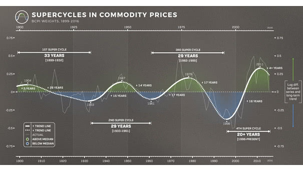
Long-Term Trends in the Price of Commodities This chart shows that a large pattern appears in the price of movements of commodities. Image: Visual Capitalist
Long-Term Trends in the Price of Commodities This chart shows that a large pattern appears in the price of movements of commodities. Image: Visual Capitalist
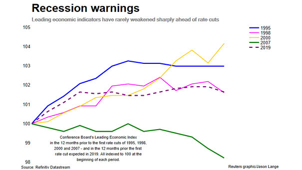
U.S. Leading Economic Indicators and Recession Warnings The Conference Board’s Leading Economic Index for the U.S. has rarely weakened sharply ahead of rate cuts, except in 2007. Currently, it doesn’t suggest that a recession is looming. Image: Reuters
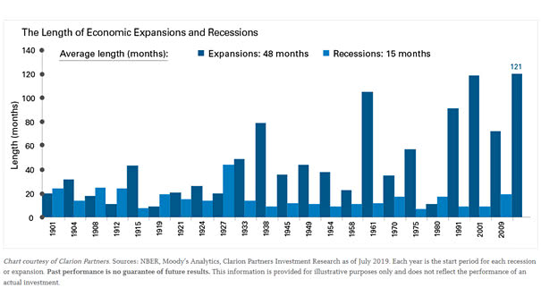
The Length of U.S. Economic Expansions and Recessions This chart puts into perspective the current business cycle, which could last longer. Image: Legg Mason
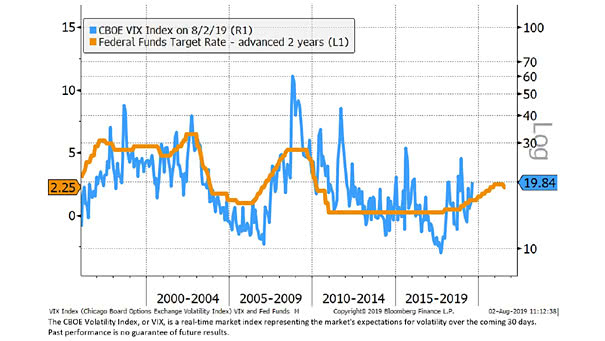
Fed Funds Target Rate and VIX Is more volatility expected ahead? This great chart suggests that the Fed funds target rate leads VIX by 2 years. You may also like “VIX is in a Transitory State” and “The Yield Curve Leads Volatility by Three Years.” Image: Bloomberg, Jeffrey Kleintop
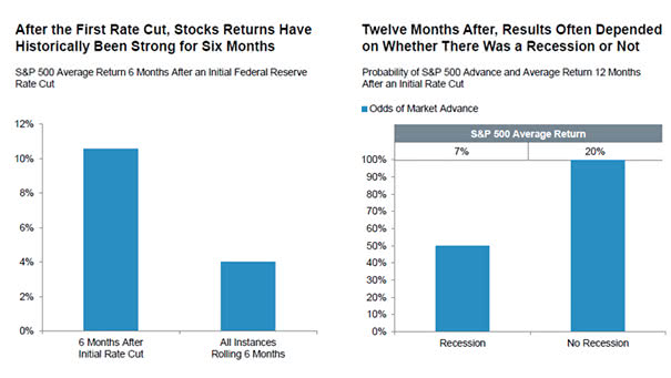
How Does A First Rate Cut Affect the Stock Market? Since 1970, the first rate cut has been bullish for the S&P 500 for the next 12 months, with recession and no recession. Image: Fidelity Management and Research
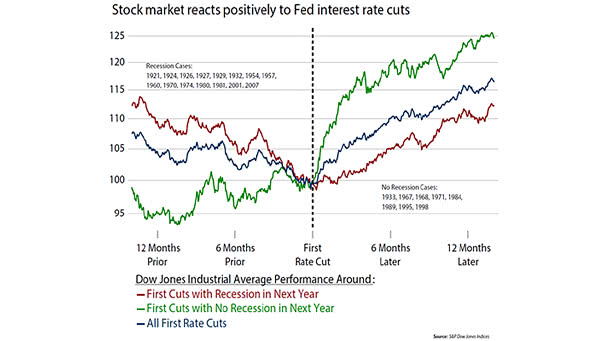
Stock Market Around First Rate Cut: Recession vs. No Recession The chart shows that the Dow Jones Industrial Average reacts positively to Fed first rate cuts. Image: Ned Davis Research
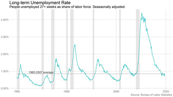
U.S. Long-term Unemployment Rate Interesting chart showing that the U.S. long-term unemployment rate is back to its long-run average. Image: Ben Casselman
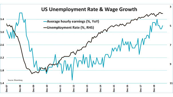
U.S. Unemployment Rate and Wage Growth U.S. unemployment rate at 3.7% and U.S. wage growth at 3.2% in July. U.S. employment growth slows, suggesting the U.S. economy is cooling. Image: Jeroen Blokland
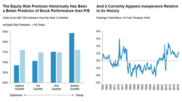
The Equity Risk Premium May Be Bullish The equity risk premium suggests that the S&P 500 is not overvalued, which may be a bullish signal. You may also like our “Stock Market Equity Risk Premium.” Image: Fidelity Management and Research
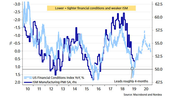
ISM Manufacturing Index and U.S. Financial Conditions Index Great chart suggesting that the ISM Manufacturing Index could be below 50 soon, and bounce back due to the drop in interest rates around the world. Image: Nordea and Macrobond
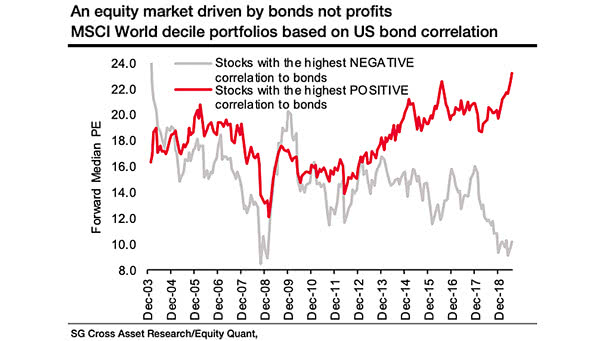
Equity Market Driven by Bonds Not Profits The chart shows a widening gap between cyclicals and bond proxies. It is clearly a cyclical bear market within a bull market, as during the dotcom bubble. Image: Societe Generale Cross Asset Research