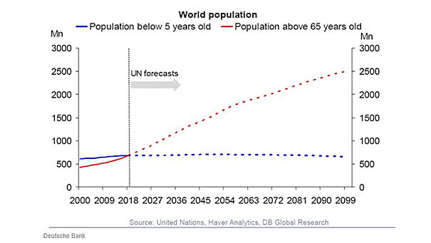
U.S. Equity Market Performance
U.S. Equity Market Performance since 1914 Excellent comparison between real (adjusted for inflation) and nominal returns on U.S. equities. Image: Saxo Bank
Global Earnings since 2006 This chart shows global earnings since 2006 (USA, Emerging Markets, Japan and Europe). As Warren Buffett said: “for 240 years, it’s been a terrible mistake to bet against America.” This chart below illustrates it well since 2006. You may also like “Earnings Matter, Over the Long Run.” Source: J.P. Morgan Asset Management
Corporate Leverage in the U.S. U.S. corporate debt is high. This chart shows that U.S. corporate leverage is close to its previous peak on a net debt to EBITDA. You may also like “U.S. Leveraged Loan Index Rating Breakdown: 2008 vs. 2019.” Image: Credit Suisse Research
Global PMI for Manufacturing Global PMI for manufacturing slides to lowest since 2012. Image: J.P. Morgan Asset Management
Negative Yielding Bonds in the Barclays/Bloomberg Global Aggregate Index These charts put things into perspective. Keep in mind that bondholders will get back less than what they paid if they hold bonds to maturity. Negative yield bonds are also a tax on bondholders. Image: Bianco Research
Equity Market Performance Around Bear Markets Interesting chart showing the average return before and after equity market peaks from 1945 to 2018. You may also like “First, Middle, Final Years of S&P 500 Bull Markets since 1975.” Image: J.P. Morgan Asset Management
U.S. Twin Deficits (% of GDP) Lead Real Trade Weighted Dollar Index by Two Years The chart suggests that the U.S. dollar should weaken over time. Image: Strategas
Americans Split on Description of U.S. Economy Today, 43% of Americans think socialism would be a good thing for the U.S.. Image: Gallup
Distribution of Calendar Year Returns: Dow Jones since 1900 The chart shows the calendar year returns on the Dow Jones since 1900, from lowest to highest. It also show that an average return (black bars) does not really exist if we take into account the distribution of calendar year returns since 118 years. Image: Jeroen Blokland
Global PMI vs. U.S. 10-Year Treasury Yield The chart suggests that the 10-year Treasury yield should be below 1.5%. Image: Pervalle Global
EPS Growth This Cycle This chart shows the exceptional earnings growth in the technology sector over this business cycle. Image: KKR Global Macro