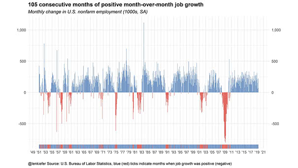
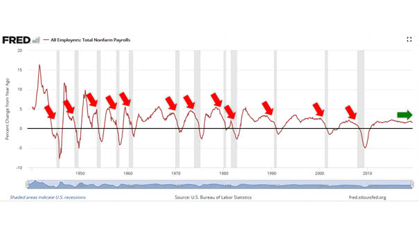
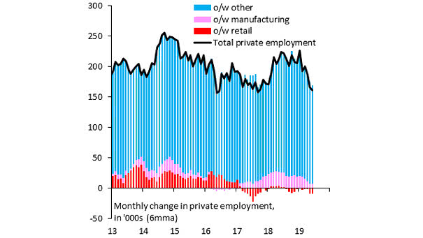
S&P 500 Cash Return Yield by Sector and Region

S&P 500 Cash Return Yield by Sector and Region Currently, the S&P 500 cash return yield (buybacks + dividends) is 5.2%, the highest since 2011. That’s much more than Europe, Japan and emerging markets. Image: Fundstrat Global Advisors, LLC

S&P 500 Low Volatility Stocks Are the Best Performing Asset YTD

S&P 500 Low Volatility Stocks Are the Best Performing Asset YTD This chart shows that S&P 500 low volatility stocks are the best performing asset year-to-date (outside of GSCI energy). Actually, high-quality stocks are a good way to protect against a weak economy. Image: Goldman Sachs Global Investment Research

History of the Real Federal Minimum Wage

History of the Real Federal Minimum Wage Today, the real federal minimum wage is worth 31% less than in 1968. It is also the longest period without an increase (adjusted for inflation). You may also like “Wage Growth vs. U.S. Home Price Growth.” Image: Economic Policy Institute

U.S. Monthly Average 30-Year Fixed Mortgage Rates

U.S. Monthly Average 30-Year Fixed Mortgage Rates Keep in mind that mortgage costs are influenced by the 10-year Treasury yield. 30-year mortgage rates = 1.739 x (10-year treasury yield)² + 0.7755 x (10-year treasury yield) + 0.0227(R² = 0.9787) You may also like “30-Year Mortgage Rates vs. 10-Year Treasury Yield.” Image: Leonard Kiefer

Labor Costs Lead Core Inflation by 6 Months

Labor Costs Lead Core Inflation by 6 Months Historically, U.S. labor costs have been a good leading indicator of core inflation, because when labor costs rise, companies tend to increase their prices. Image: Legg Mason

Demographics Explain Sovereign 30-Year Yields Across Emerging Markets

Demographics Explain Sovereign 30-Year Yields Accross Emerging Markets Another great chart showing that emerging market demographics explain 30-year sovereign bond yields. An R² of 0.80 is quite high and significant. You may also like “U.S. Population Growth vs. U.S. 10-Year Treasury Bond Yield.” Image: Arbor Research & Trading LLC

“Yield Curve” Google Trends vs. 10Y-3M Yield Spread

“Yield Curve” Google Trends vs. 10Y-3M Yield Spread This interesting chart shows the Google trends interest for the “yield curve” compared to the U.S. 10-year minus 3-month Treasury yield spread. If history helps us predict the future, the next market peak could be in 2021 or later, maybe. Image: Ken Fisher

S&P 500 and Past Easing Cycles

S&P 500 and Past Easing Cycles The S&P 500 did rather well after easing cycles began, especially during Fed insurance cuts. You may also like “Market Reaction to Fed Insurance Cuts vs. Fed Recession Cuts.” Image: Fidelity Investments